2. Document Library Pro settings
The Document Library Pro plugin settings pages (Documents → Settings) let you configure your document libraries. You can also configure the main settings in the setup wizard, which opens when you first activate the plugin and can be relaunched from the settings page.
Tip: The options on the plugin settings page set the defaults for all of your document libraries. You can override most of these options for individual libraries using shortcode options.
Note: Some options only appear when the new document library frontend is active, and a few only appear in legacy mode. These are labelled below. See legacy mode for the full picture.
General tab
The General tab contains options which will affect all your document libraries, whether you are using the table or grid layout.
License key
Enter your license key here. This is essential for the plugin to work.
Document library page
Select which page you wish to use as your main document library page (if required).
When you install the plugin, it automatically creates a page called ‘Document Library’ and selects it here. You can delete this and select a different page if required.
The plugin will add the shortcode [doc_library] to whichever page is selected here. It lists all your documents using the default options. You can customize these settings below, or directly in the shortcode for more fine-grained control.
Click the 'View page' link to visit the selected page in the front end.
Document data
Document fields
Select which fields you would like to use for your documents. These fields will be displayed on the single document page if you are using it; on the Add/Edit Document page; and also the front end document submission form. The content, excerpt and featured image can also be displayed in your document lists.
- Content - This field can be used for a description of the document, or to add the full content of the document if you want it to be available online without having to download it.
- Excerpt - Use this field for a brief summary of the document.
- Featured image - Upload an image if you plan to include an image in the document library.
- Comments - Allow visitors to add comments for each document, just like they can with WordPress blog posts.
- Custom fields - Enable the default WordPress custom fields feature so that you can add additional fields for your customers.
- Authors - Record the author of the document (note: this is different from the WordPress user who added the document).
In addition to these fields, your documents will have all the standard WordPress fields such as the title, content, date, author, document categories, and document tags.
If you would like to store extra information about your documents, see our article about how to do this.
Document slug
Change the URL structure of your individual document pages by typing in your custom slug in the text field.
For example, you can change the default slug from https://documentlibrary.barn2.com/document/diversity-policy to any other custom slug such as https://documentlibrary.barn2.com/policies/diversity-policy.
Version control
Enable the version control option to track previous versions of a downloadable document. When you enable version control, the following happens:
- A new 'Replacing files' option appears underneath, which allows you to choose what happens to previous versions:
- When replacing a file, keep the original in the Media Library - Enable this to keep all versions of a file so that you can view them and roll back to them if needed in the future.
- When replacing a file, delete the old version from the Media Library - Enable this to automatically remove old versions from the Media Library whenever you replace a document.
- A new 'Version editor' section appears on the Edit Document screen. You can use this to view previous versions, rename versions, and so on.
Front end document submission
The following options control what happens when people submit documents via the front end submission form:
- Enable admin email - Enable this to send an email to the administrator (as set under Settings → General) whenever a new document is submitted.
- Enable moderation - Enable this to hold newly submitted documents for moderation by an administrator. If the email is enabled then this will include instructions on how to approve it. The document will not be added to the library until after it has been approved.
- Limit categories (Advanced plan only) - Enable this if you would like the category selector on the front end submission form to only include categories that each user has access to.
Lead capture
The following options control the collection of email addresses before people can download documents:
- Enable - Turns on the lead capture feature (disabled by default).
- Recipient email address - The email address that receives a notification each time a user submits the lead capture form.
- Bypass for logged-in users - Skip the lead capture form for logged-in users, so only new visitors are required to complete it.
- Heading text - The title displayed at the top of the popup form.
- Introduction text - Descriptive text shown below the heading.
- First name text - Label for the first name field.
- Last name text - Label for the last name field.
- Email address text - Label for the email address field.
- Privacy consent text - Label for the privacy consent checkbox. Leave blank to disable the checkbox.
- Submit button text - Label for the submit button.
- Confirmation message text - The message shown to users after they submit the form.
- Download button text - Label for the download button that appears after submission.
Display tab
The following options control the contents and layout of your document lists.
Default layout
Here's a video we made about all of the main layout and display options available in Document Library Pro. Read below for written instructions.
Choose the default layout for your lists of documents. The options are:
- Table - This is the default option and lists documents in a tabular layout with multiple columns of information.
- Grid - Displays documents in a tile-based grid layout.
Table
These options set defaults for your document tables. If you are only using the grid layout then you can ignore them.
Columns
Use the column builder to select the columns of document data to appear in the table. Drag-and-drop to change the column order, and use the pencil icon to access additional settings (e.g. to control whether the column is clickable, adjust column names, widths, etc.).
Grid
These options set defaults for your document grids. If you are only using the table layout then you can ignore them.
Grid content
Enable all the fields that you wish to display in the grid of documents.
The available fields are: image, title, filename, file type, file size, download count, categories, authors, excerpt/content, custom fields, and document link.
Tip: If you want to display additional data then we recommend using the table layout instead.
Clickable fields
Choose whether users can access the single document page by clicking on other fields in the document library. The following fields can be formatted as links: title, doc_categories, file_type, filename, doc_author, and image.
Enter all to add links to all possible fields, none to disable all links, or add a comma separated list (without spaces) of the specific fields that should be clickable.
Number of columns
Choose the number of columns from the dropdown list to limit the grid layout columns on the page. Select Auto-size to make the grid columns adjust depending on the device screen and page spacing.
Document title
Choose what happens when someone clicks on a document title in the grid:
- Link to single document page
- Download file
- No link
Link destination
Choose what happens when someone clicks on a file name in the grid. The options are the same as for the document title, above.
Sorting
Sort by
Choose an option for how the documents will be sorted when the library first loads. (If you are using the table layout then visitors can also sort the document library by clicking on any column header.)
If you select Other, a Sort column field appears where you can enter the name of any column in your table that isn't in the list, for example a categories column or a custom field.
Sort direction
Choose whether the documents will be ordered in ascending or descending order. Leave this set to Automatic to use descending order for date-based sorting and ascending order for everything else.
Multi-column sorting
Tick this box to allow visitors to sort the table by more than one column at a time. This is useful when two fields matter together, such as category and date, or file type and file size.
Download button
Control the behavior of the 'Document link' field (if present).
Button behavior
Choose what happens when someone clicks on a link to the document. This only affects the links in the 'Link' field of the document library, and not other clickable fields such as the document title.
- Download file - this is the default and opens the document, rather than taking users to the single document page.
- Link to single document page - takes users to the single document page, from which they can click on a link to the actual document if required.
Style
Control the appearance of the links in the document link field:
- Button - A button containing the 'Button/link text' which you can set below.
- File type button - Either displays an icon representing the file type, or a generic icon for uncommon file types.
- Text link - A text-only link.
Depending on which style is selected, additional options may appear below:
Button/link text
If the link style is set to 'button' or 'text link' then you can control the text that appears in the link field. The default is 'Download'.
Icon
Enable this to display a download icon next to the link.
New tab
Enable this to open the links in a new browser tab.
Preview button
Enable preview?
Enable this option to enable users to preview documents in a lightbox before (or instead of) downloading them. The preview link will appear in the link field of the document library, and also on the single document page.
Style
Control the appearance of the preview buttons:
- Button - A button containing the 'Button/link text' which you can set below.
- Text link - A text-only link.
Depending on which style is selected, additional options may appear below:
Button/link text
If the link style is set to 'button' or 'text link' then you can control the text that appears in the link field. The default is 'Preview'.
Icon
Enable this to display a preview icon next to the link.
Multi-downloads
Allow multiple downloads?
Enable this to add multi-select checkboxes next to each document in the table layout, which people can use to download the selected documents as a zip file.
Button text
This option lets you replace the 'Download Selected Documents' text in the multi-download button with any other text of your choice.
Button position
Choose whether to display the 'Download Selected Documents' button above or below the table, or both.
Select all
Tick this box to add a 'Select all' link to the table header, so that visitors can tick every document in one click instead of working through the checkboxes one at a time. This is useful for libraries where people routinely want the whole set, such as a full pack of forms or a complete price list.
If the library is filtered or searched at the time, 'Select all' applies to the documents that currently match.
Folders
Enable folders
Enable this option to structure your document libraries into category-based folders.
If you have multi-level categories then it will work like this:
- All the top-level categories will be listed as closed folders when the page first loads.
- When a user clicks on a folder, it will open to contain documents that are only in that top-level category; with folders underneath for the sub-categories.
- When the user clicks on a sub-category folder, they will see any documents which are only in that sub-category; or they will see any sub-sub categories listed as folders underneath.
Sort folders by
Sort the folders by category name, category slug, category order (menu order), or the number of documents in the category.
Folder display
By default, the folders will be closed when the document library first loads so that customers can click on a folder name to open it. You can change this so that any or all of the folders are loaded open by default. The options are:
- Open - all folders are open.
- Closed - all folders are closed.
- Custom - a 'Custom' field appears where you can enter a comma separated list of the category ID's of the folders that you want to display open by default.
Search tab
Use the following options to control the search box and filters that appear above your document lists. You can also use the Document Library Pro: Search Box widget to add a search anywhere on your site.
Search box
Tick this box to display a keyword search box above your lists of documents.
Filter locations
This option controls where the filter dropdowns appear. You can add filters for document categories, tags, author or any custom taxonomy. Tick one or both locations:
- Display filter dropdowns above the table - shows the filters in a row above the library.
- Show filters in column headers - shows a filter inside the heading of each relevant column.
A filter editor appears underneath as soon as you tick either location. Use it to choose which filters to display and to rename any of them, in the same way as the column editor on the 'Display' tab. Drag-and-drop to change the order in which the filters appear.
Multi-select filters
Tick this box to let visitors select more than one value from each filter at once, instead of being limited to a single choice per filter.
Active filters
Tick this box to display a summary of the currently applied filters above the library, so visitors can always see exactly what they are looking at.
Filter counts
Tick this box to show the number of matching documents next to each filter option, so visitors can see what's worth selecting before they click.
Search filters
Legacy mode only. This option controls whether filter dropdowns appear above the document library. It is replaced by the 'Filter locations' option, above, when you are using the current document library frontend.
Search results
If you have used a widget or shortcode to add a standalone document search box anywhere on your site, then you need a page to display the results on. A 'Document Search Results' page has been automatically generated for you, and is selected here. If you prefer, then you can select a different page to use for the document search results.
Design tab
Design
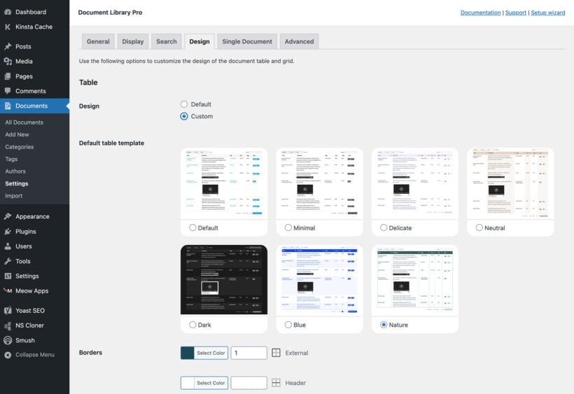
- Default - The document library styles (e.g. font size and color) will automatically be inherited from your theme.
- Custom - Enable this option to override the default styling for either the table and/or grid layout. You can then select from a range of templates, and use the customization options below to further tweak the design as needed.
Tip: To change colors, select from the color picker or add any hexadecimal color value (e.g. #757575). To change the size, use the up/down arrows or enter the size in pixels. If you want to add an RGB color then you can use a color convertor to get the right value.
You can add additional styling using additional CSS.
Folders
Select 'Custom' to customize the folders which appear to the left of each collapsible category in the document library:
- Top-level folder color - Choose a color for the main folders (i.e. your top level document library categories). The default is yellow.
- Sub-level folder color - Choose a color for the lower level folders which appear when the customer views a folder which has sub-categories. The default is black.
- Closed and open folder icon - If you would like to replace the default folder icons then you can do this by pasting the code for an SVG file containing the replacement logo. The plugin uses SVG's because these are retina icons instead of images, which is better for performance and compatibility on different devices.
Single Document tab
- Default layout - Select a layout for the single document page, or click the links to customize a layout or create a new one using the WordPress block editor.
- Display - Choose whether or not the featured image and/or comments will be enabled on the single document page. (Note: Edit the layout to control which other fields appear on the page, such as the document content, download buttons, etc.)
Advanced tab
The following options allow you to configure advanced settings for your document libraries.
Content length
If you are displaying the document content in the library, then this option controls the number of words that will appear. Enter a whole number, or -1 to display the full content.
Shortcodes and media
Tick this box if you want content added by other shortcodes to appear within the text fields in the document library.
For example, you might be using a button shortcode to add other types of button; embedded audio or media players; icon shortcodes; etc. Alternatively, you might have added the content of a document using the block editor and want to display the fully formatted information on the document library page.
Text links
Enable this to open links on columns which are not the document link column in a new tab (e.g. if you have added links to the title or categories column).
Note: The option to open the document link column in a new tab is in the settings for download buttons, on the 'Display' tab.
Image lightbox
If you have included images in the document library then enabling this option will make the featured image open in a lightbox/popup when someone clicks on it.
If you untick this box then clicking on an image will link visitors to the document instead. You can disable this behavior using the clickable fields option on the 'Display' tab.
Note: The image lightbox currently applies to libraries running in legacy mode only.
Unique URLs
Tick this box to give each document library a unique URL that reflects its current state. The URL captures the active search, filters, sorting, and pagination, which means visitors can link directly to a specific view of your library.
This is useful in lots of scenarios. Someone can bookmark a filtered view to come back to later, a support agent can send a customer a link to an exact list of documents, or a team can share an internal library pre-filtered to the right department. It also means the browser back button returns visitors to the view they were looking at, instead of resetting the library.
This option is not available in legacy mode.
Frontend library
Document Library Pro uses a modern table library to display your documents. If you experience compatibility issues with the new frontend, you can tick this box to switch back to the legacy jQuery DataTables frontend. We only recommend enabling this option if you need it for compatibility.
If you were already using Document Library Pro before version 4.0, this box is ticked for you so that your libraries keep working exactly as before. Untick it when you are ready to move to the new frontend.
Table options
Image size
This option controls the size of the featured image in the image column. Enter the required image size in pixels, e.g. 50x70 will set the image to 50 pixels wide by 70 pixels high.
Accent-insensitive search
Legacy mode only. Enable this so that the search box treats accented and non-accented characters as interchangeable (e.g. Zurich and Zürich).
The current document library frontend handles accented characters in search as standard, so this option is not needed there.
Diacritics sorting
Legacy mode only. Enable this to sort accented characters naturally, so that "árvíztűrő" is sorted with the "A" words instead of after "Z".
Caching
This option allows the contents of your document tables to be cached to improve performance and speed up page load times.
If you tick the 'Caching' box then you can also set the 'Cache expires after' time to control how often the cache is cleared. Enter a whole number of hours. A 'Clear cache' button appears underneath, which removes any cached data immediately. We recommend clearing the cache after making changes so that you and your customers can see them straight away, instead of waiting for the cache to expire.
Document limit
Enter a whole number to specify the maximum number of documents that can appear in the table, or -1 to show all documents.
Responsive display
Choose how the "child rows" are displayed when viewing a document library table on smaller screen sizes (or when there is too much data to fit in the table):
- Click a plus icon to display a hidden child row - the default option. Extra data is displayed in a hidden child row.
- Expand the child row automatically - extra data is displayed in a child row which is expanded automatically when the table is first viewed.
- Click a plus icon to open a modal - extra data is displayed in a modal window when the "+" icon is clicked.
Pagination
Documents per page
Enter a whole number to control how many documents appear on each page of the library, or -1 to display all documents on one page. If there are more documents than the number of rows per page then pagination links will appear linking to the other pages.
Document total
Positions, shows or hides the label which displays the number of documents (e.g. ‘Showing 1 to 10 of 50 documents’).
Pagination style
Choose a style for the pagination buttons. This can be any combination of Previous or Next links, plus actual page numbers.
Pagination position
Positions, shows or hides the pagination buttons.
Page length
Positions, shows or hides the ‘Show [x] documents’ dropdown.
Infinite scroll
Tick this box to load more documents automatically as the visitor scrolls down the page, instead of using the numbered pagination buttons. It works particularly well for browsing-style libraries where visitors are scanning rather than searching for something specific.
When infinite scroll is enabled, the pagination options above are replaced by the Container height setting below.
This option is not available in legacy mode.
Container height
When infinite scroll is enabled, you can optionally set a fixed height for the scrolling area of the library. The default is 70vh (70% of the height of the browser window), but you can enter any CSS length unit.
How to change the container height for infinite scroll
Next steps
The plugin settings page lets you set defaults for the most widely used options. You can override these and use additional options directly in the document library shortcode. Please see the complete list of shortcode options.
Next, it's time to start adding documents to your document library!
Adding Documents