Mobile visibility & responsive options
WooCommerce Product Table comes with several options for controlling how the tables behave on different screen sizes, for example mobiles and tablets.
The options on this page are controlled individually in the shortcode for each product table, and do not appear on the plugin settings page.
Responsive visibility
This option is available on the 'Edit table' screen (not the initial table builder) and appears when you edit a column and enable the 'Advanced' toggle.
It gives you fine-grained control over which devices to show each column on, and when to collapse it into the hidden 'child' row (or modal window, depending on your Responsive display setting). For example, selecting 'Tablet' for a column means it will display on tablet devices, but will appear in the child row on mobiles and desktop screens.
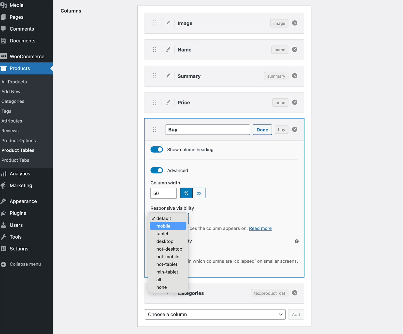
The dropdown lists the most useful options:
- Default - Let the table decide when to show the column, using the priorities option if set.
- Mobile - Column will display on mobiles, and is hidden at other screen sizes.
- Table - Column will display on tablets, and is hidden at other screen sizes.
- Desktop - Column will display on desktop screen sizes, otherwise hidden.
- Not desktop - Column will display on mobiles and tablets, but is hidden on desktops.
- Not mobile - Column will display on desktop and tablets, but is hidden on mobiles.
- Not tablet - Column will display on desktop and mobiles, but is hidden on tablets.
- Min tablet - Column will display on tablets or desktops, hidden on mobile.
- All - Force the column to display at all screen sizes where possible.
- None - Never shown in the main table (only visible when the child row or modal is expanded).
For more flexibility, you can set the responsive visibility for each column in the [product_table] shortcode. This allows you to use all the breakpoint options listed in the DataTables documentation, which is the library that WooCommerce Product Table uses under the covers.
Some notes:
- You can use this option with the 'Responsive display' option. However, it will override the Priority option so you shouldn't use both together.
- The plugin can only display columns that physically fit into each screen size. The Responsive visibility option will be ignored if the columns that are set to visible do not fit on a specific screen size. For example, if you have 20 columns and set them all to 'All' then some of them will still be hidden. We have coded the plugin this way to prevent it from ever looking broken on any screen size.
I've hidden the first column and it's not working!
By default, it's not possible to hide the first column in your table because the expandable + plus icon is contained within the first column. If you need to hide the first column, then you'll also need to use the responsive_control option to put the + plus icon in its own column of the table.
Priority
 This option is available on the 'Edit table' screen (not the initial table builder) and appears when you edit a column and enable the 'Advanced' toggle.
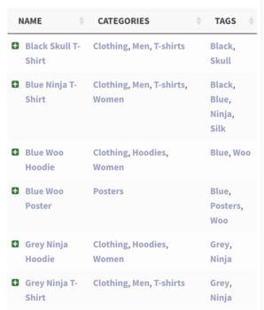
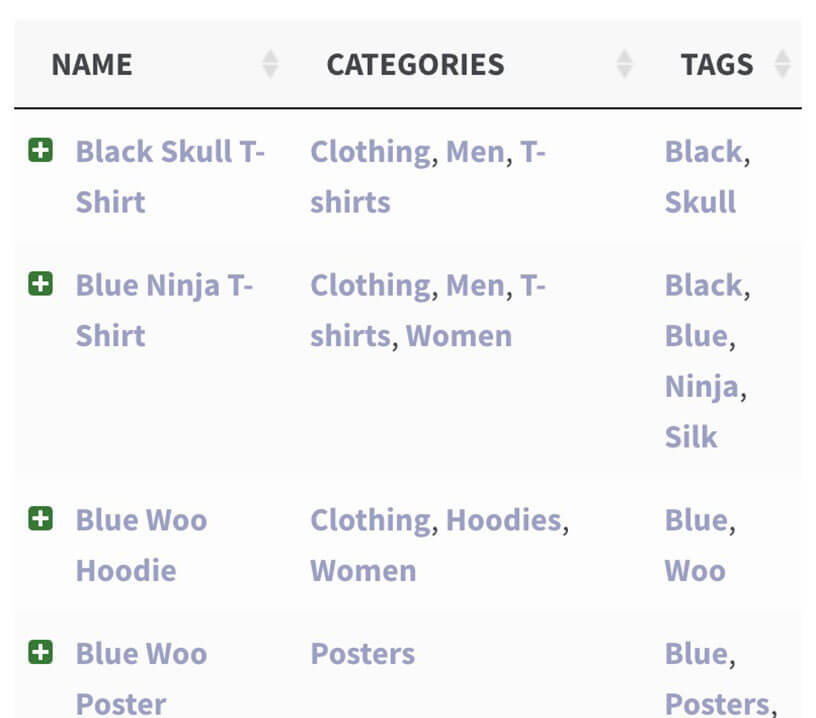
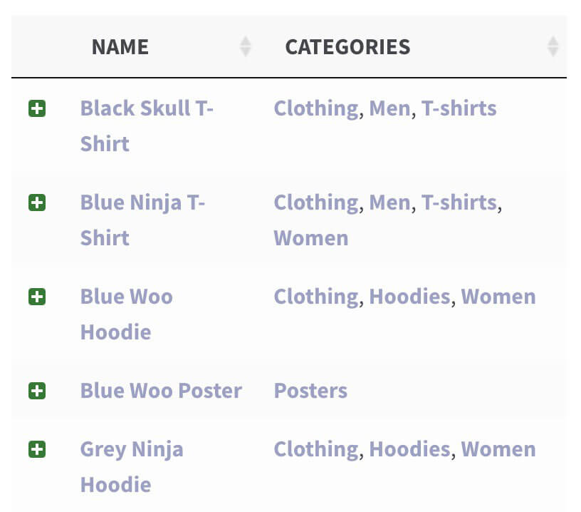
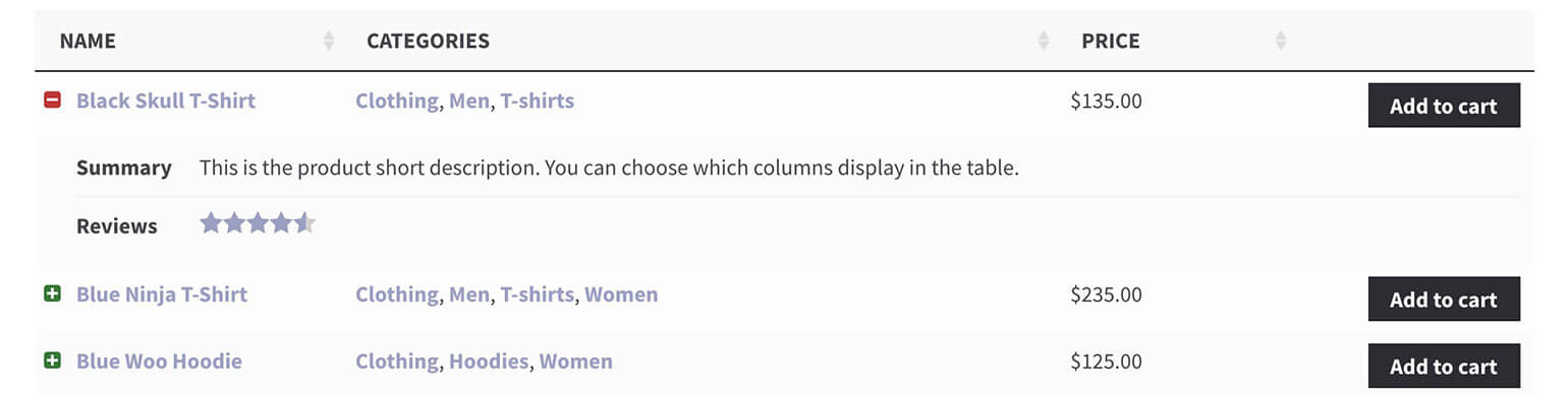
It lets you choose which columns to hide first when there are too many to fit in the available space. This is useful on smaller screen sizes (mobiles, tablets, etc.) or when you have a lot of columns in your table and the plugin can’t fit everything in. When the screen size gets too small, the plugin will collapse certain columns down so they are no longer visible, and a "+" icon will appear at the left of each row. This allows the user to expand the row to show its full contents.
Enter a priority for each column to control the order in which they are "collapsed" on smaller screens. This overrides the default priorities in WooCommerce Product Table. The lower the number, the higher priority that column has. So a column with a priority of "1" would have the highest priority and be collapsed last.
Responsive display
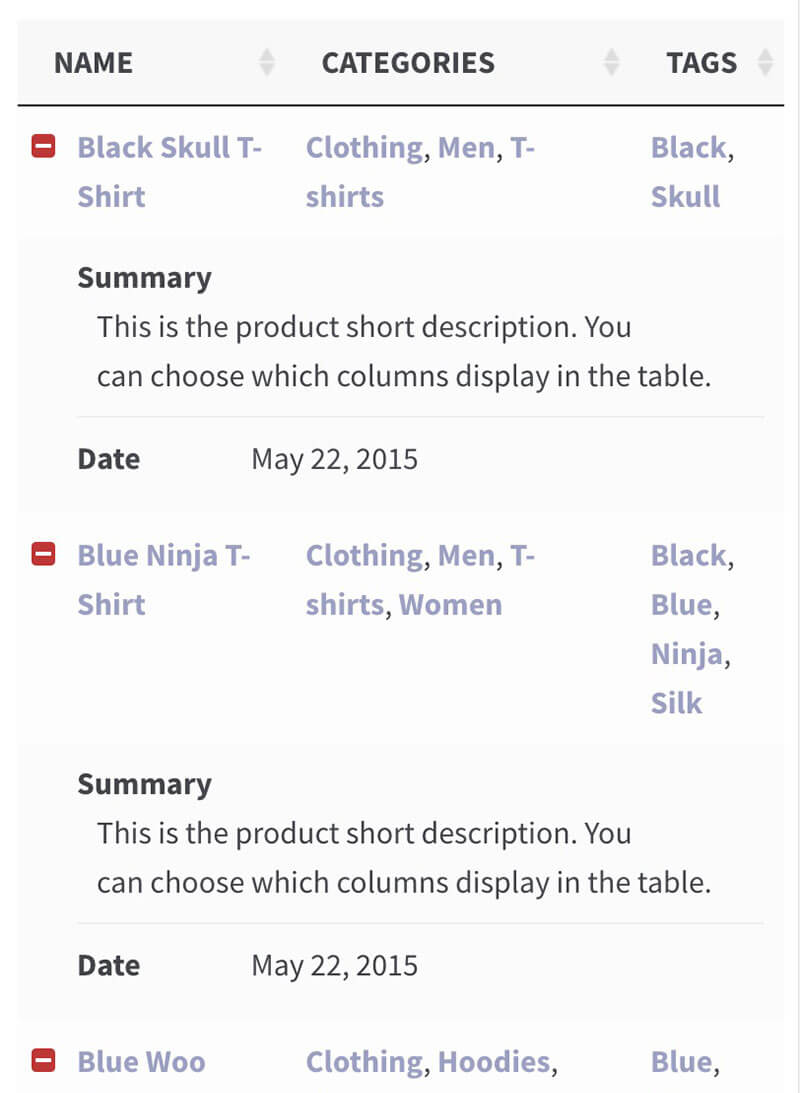
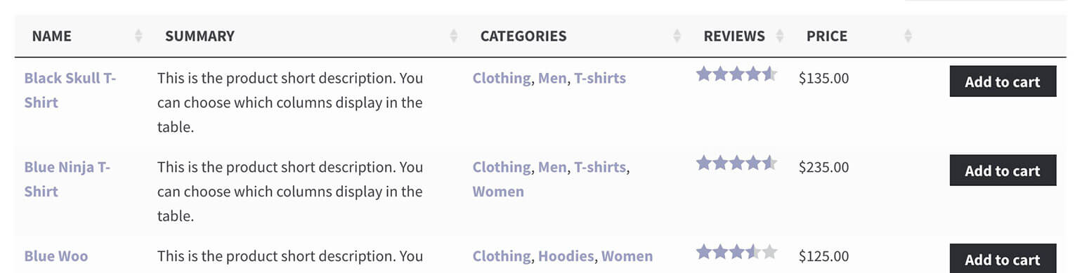
This option determines how the "child rows" are displayed when viewing the table on smaller screen sizes (or when there is too much data to fit in the table). By default, the extra columns are displayed inside a child row which can be shown by clicking the "+" icon at the start of each row. You can also choose from the following options:
- Child row – The default option. Extra data will be displayed in a hidden child row.
- Child row visible – Extra data is displayed in a child row which is expanded automatically when the table is first viewed.
- Modal – Extra data is displayed in a modal window when the “+” icon is clicked. (Note: Not compatible with the 'checkbox' add to cart option - see further information below.)

Warning: The 'checkbox' add to cart button style is not compatible with the modal window option. This is because multi-select checkboxes can only appear on a single page, and not within separate modal windows. If you're using the 'modal' option then we recommend using the 'button' or 'button_checkbox' options so that mobile users can still add your products to the cart.
Responsive control
The 'Responsive control' option is only available as a shortcode option.
When the plugin can’t fit all the data within the space available (for example, on mobile devices), a 'plus' icon appears to the left of each row to allow the user to show or expand the full content. The responsive_control option sets whether the '+' icon control is displayed inside the first column or within its own separate column. It default to 'Inline'.
Wrap
The 'Wrap' option is only available as a shortcode option. It tells the table whether to wrap long content onto multiple lines, or to keep everything on a single line and hide the rest. It is enabled by default, which means that longer content will "wrap" onto extra lines as needed. Disabling it will ensure that each row is exactly one line high.
Troubleshooting - Why can't I hide the first column of my table?
If the above options aren't working when you try to hide the first column of your table on smaller screens, then this is because the first column also contains the + icon. This is needed to let users reveal the hidden child row, so you can't hide the first column in this case.
To fix the problem, add responsive_control="column" to the product table shortcode. This will put the + icon in its own column so that you can successfully hide the first column.
FAQ - Can users click on the first column to open the hidden child row instead of the + icon?
Yes, you can do this by disabling the link to the single product page in the first column. If the first column does not link to the single product page, then users can click on it or the plus icon to open up the hidden child row.
Please note that this will only work if the Responsive control option is set to Inline (the default) rather than Column.