Mobile visibility & responsive options
Posts Table Pro comes with several options for controlling how the responsive tables behave on different screen sizes, for example mobiles and tablets.
The responsive visibility and priority options can be set in the Advanced Column settings when you add or edit a table. Other responsive options can only be used by adding them directly to a Posts Table Pro shortcode.
Responsive priority
The priorities option is used to determine the order in which columns are “collapsed” on smaller screens. Some default priorities are used, but if you wish to override these you can use this option. The lower the number, the higher priority that column has. So a column with a priority of “1” would have the highest priority and be collapsed last.
If you had a table with three columns – title, author, and categories, and you wanted to make title the most important, categories second most, and author least important you would set the title to 1, author to 3, and categories to 2.
Responsive visibility
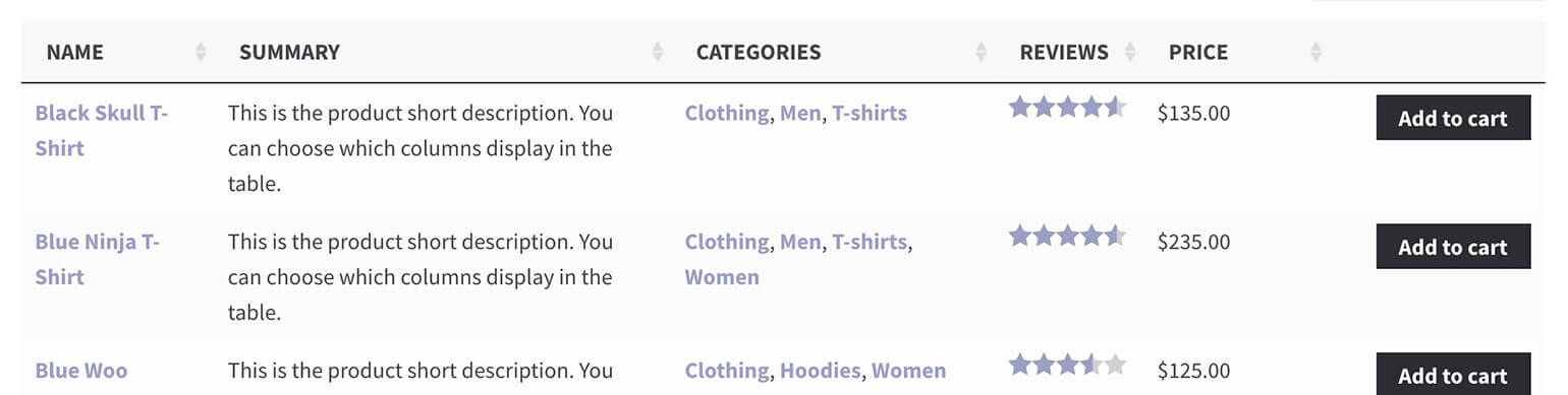
This option gives you fine-grained control over which columns are displayed on different screen sizes and devices.
For example, setting the responsive visibility of a column to 'tablet' means it will display on tablet devices, but not on mobiles or desktop screens.
By default, Posts Table Pro will show or hide columns on smaller screens using the priorities option described above (or the default priorities if none are set). For added control, you can choose which devices to show each column on.
The advanced options when you add or edit a table column let you choose from the most commonly used options. You can also use the shortcode (details below) to add additional visibility options - see the full list in the DataTables documentation (this is the JavaScript library that Posts Table Pro uses under the covers).
Some notes:
- This option used to be called column breakpoints or column_breakpoints and has been renamed for clarity.
- The
alloption means the column will always be visible, regardless of screen size. Thenoneoption means it will not be shown in the table, but the column will still show in the child row (or modal window) when expanded. Thedefaultoption will let the plugin decide when it is hidden (using the priorities option if set). - Posts Table Pro can only display columns that physically fit into each screen size. The responsive visibility option will be ignored if the columns that are set to visible will not fit on a specific screen size. For example, if you have 20 columns and set them all to 'all' then some of them will still be hidden. We have coded the plugin this way to prevent it from ever looking broken on any screen size.
I've hidden the first column and it's not working!
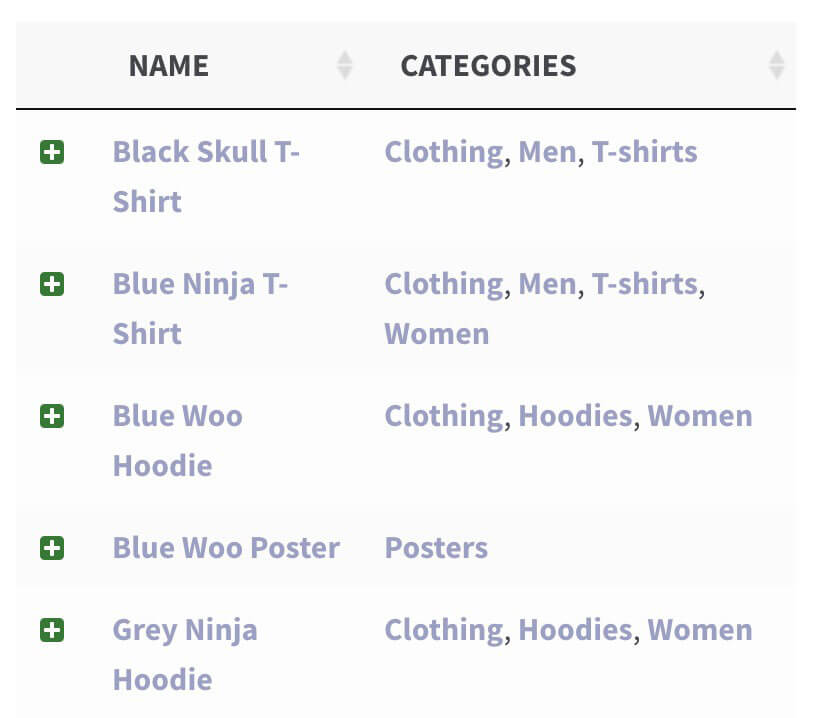
By default, it's not possible to hide the first column in your table because the expandable + plus icon is contained within the first column. If you need to hide the first column, then you'll also need to use the responsive control option to put the + plus icon in its own column of the table.
Responsive control
When the table can’t fit all the data within the space available (for example, on mobile devices) a “plus” icon appears to the left of each row to allow the user to show or expand the full content. The responsive control shortcode option sets whether that “+” icon control is displayed inside the first column or within its own separate column. Defaults to inline.
-

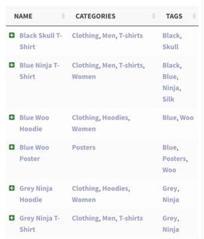
- Responsive control set to inline
-

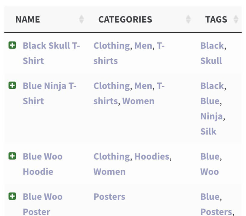
- Responsive control set to column
Responsive display
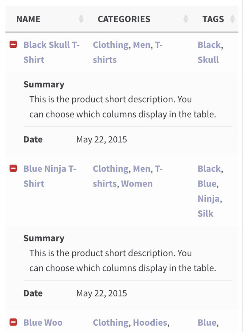
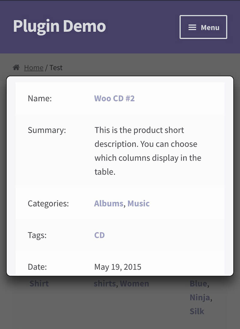
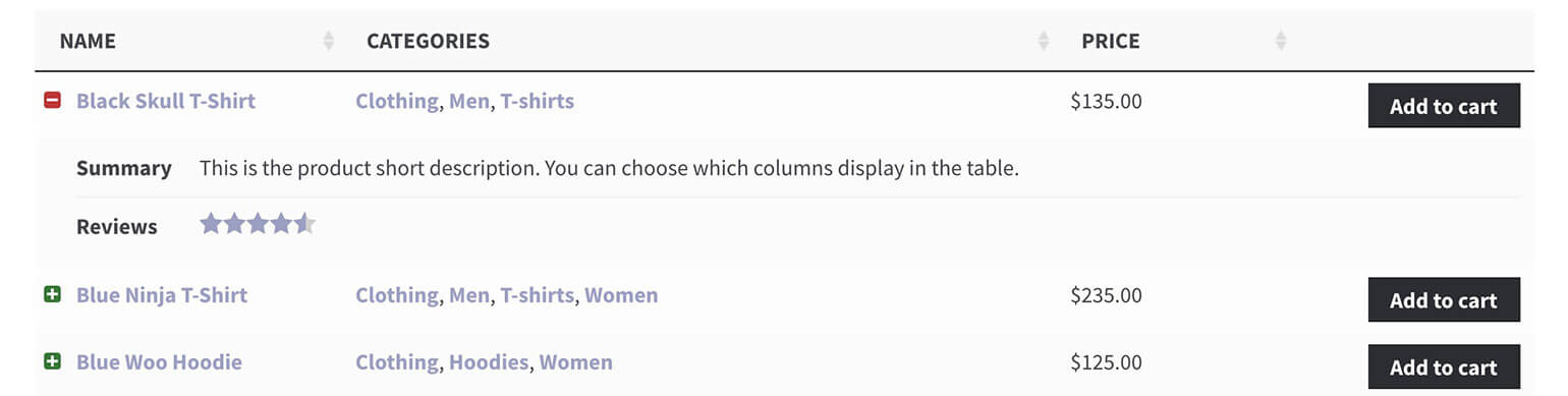
The responsive display shortcode option controls how the “child rows” are displayed when viewing the table on smaller screen sizes (or when there is too much data to fit in the table). By default, the extra columns are displayed inside a child row which can be shown by clicking the “+” icon at the start of each row. You can choose from the following options:
Child row– the default option. Extra data will be displayed in a hidden child row.Child row visible– Extra data is displayed in a child row which is expanded automatically when the table is first viewed.Modal– Extra data is displayed in a modal window when the “+” icon is clicked.
-

- Child row hidden

-

- Child row visible
-

- Modal
Wrap
The wrap shortcode option tells the table whether to wrap long content onto multiple lines, or to keep everything on a single line and hide the rest. It is enabled by default, which means longer content will “wrap” onto extra lines as needed. Setting it to false ensures that each row is exactly one line high:
-

- Wrap set to true
-

- Wrap set to false
Troubleshooting - Why can't I hide the first column of my table?
If the above options aren't working when you try to hide the first column of your table on smaller screens, then this is because the first column also contains the + icon. This is needed to let users reveal the hidden child row, so you can't hide the first column in this case.
To fix the problem, set the responsive control option to column to put the + icon in its own column so that you can successfully hide the first column.