Creating product options
Once you have installed WooCommerce Product Options and activated your license key, it's time to start adding options to your products.
You can create as many product options as you like, structured into groups. You can either display the same options on all your products, or show/hide each group on specific products and categories.
Create and manage your product options in the WordPress admin under Products → Product Options. This page lists all your option groups, each of which can contain one or more product options. You can add product options manually, or import them from another site.
You can watch this video, or find full written instructions below:
Option groups
When you first install the plugin, an empty 'Product Options' group is automatically created for you. Edit this as you wish, or delete it and create your own groups from scratch:
- Use the 'Add New' button to create a new options group.
- Hover over an existing group to edit, duplicate or delete it.
- Use the 'Sort' icons to re-order the list of groups. This will be used on any products that have more than one option groups visible - the group listed first will appear first on the product page.
- Use the Enabled/Disabled toggle to control whether or not the group is active on the front end of your site. If you disable a group then this will immediately remove it from all products.
Use the 'Edit options group' page to add/edit the name of the group, choose which products it appears on, and to add product options.
Tip: For a quicker way to edit an option group, you can also click the pencil icon which appears at the top of the group on the product page in the front end. This only appears for logged in Administrators and Store Managers.

Option group name
Enter a name for the group of options. This will only be used in the WordPress admin and won't be visible to your customers.
Tick the 'Display' box if you want to display the name of the group above the options.
Visibility
By default, the options in the group will be added to all the products in your store. To change this, use the visibility settings to choose which products and categories the options will appear for:
- Products - Start typing the name of a product, and select all the products that you want the option group to appear on.
- Categories - Start typing the name of a product category, and select all the categories that you want the option group to appear on.
- User roles - Select which of your WordPress user roles can see the option group.
You can combine the above to create the exact logic you require.
Exclusions
Use the exclusion options to select products, categories or user roles where you do NOT want the option group to appear.
Further reading: Learn more about the logic for the visibility options.
WordPress caps the number of records returned by a query at 100 rows. For this reason, we do not recommend adding a large number of products to the inclusion or exclusion lists. If you need to use a group of options on a large number of products, we recommend using categories instead. See why queries are capped at 100 results.
Price display
Choose how to display the main product price which appears at the top of the product page.
- Default - The product price display is inherited from your theme. (Most themes display the price under the product name.)
- Add a prefix or suffix to the main product price - Add some extra text that will appear before and/or after the main product price. For example:
- If you're selling fabric by the meter and want to display the main product price as "$25 per meter" then you would set the price display suffix as "per meter".
- If you're also using the 'Price display suffix' setting in WooCommerce → Display → Tax then both suffixes will display, e.g. "$25 per meter inc. VAT".
- Hide the main product page - The main product page is hidden. When the customer selects options that have a cost then the new total price will be displayed underneath, above the add to cart button. (Tip: There's a separate option to hide the prices of individual product option choices.)
Note: If multiple option groups are displayed on a product page then the price display will work like this:
- If at least one group is set to "hide", then then the price will be hidden (this has the highest priority).
- If at least one group has a prefix/suffix set, then prices will be prefixed/suffixed.
- If more than one group have a prefix/suffix, the first one will be used based on the order the groups are listed in the WordPress admin.
- A prefix and a suffix can be merged from different groups: for example, if Group A has a prefix but no suffix and Group B has a suffix but no prefix, then the price of products that have both groups assigned will be prefixed with the setting from Group A and suffixed with the settings with Group B (the priority order of the previous point still applies).
- Developers can use the filter hook
wc_product_options_price_display_when_zeroto control the behavior for products where the main price is zero.
Adding/editing product options
The 'Edit option group' page contains a table where you can add as many options as you like:
- Drag and drop the 'Sort' icons to change the order of the options. This changes the order in which they appear on the front end of your website.
- Use the '+ Add option' button to add new product options, and hover over an existing option to edit, duplicate or delete it.
Option name
Enter the name of the option, e.g. "Pizza Toppings". In a minute, you can choose whether or not to display this to visitors.
Tick the 'Display' box if you want to display the name of the product option on the front end of your site (e.g. "Pizza Toppings"). Alternatively, select 'No' to hide this and just show the choices without a title above.
Type
WooCommerce Product Options comes with 14 field types, plus 2 for adding static information alongside your options. Click on a type to select it.
Note: If you wish to display existing product variations then this is only possible for the checkbox, radio button, dropdown, image button, color swatch, and text label field types.
Types of product option:
- Checkbox (the default) - Display 1 or more tick boxes, of which customers can tick one or more.
- Radio Buttons - Display 1 or more radio buttons, of which customers can select only one.
- Dropdown Select - Display a dropdown list of options. Customers can select one by default - to enable multi-select, either delete or change the maximum quantity.
- Text Input - Display a text box that customers can type into. We recommend using this option type for collecting any text-based information including custom messages, email, address, URL/website, date/time, color picker/hex value, or password.
- Paragraph - Display a larger text box where customers can type larger amounts of text.
- Number - Create a field where the customer can enter a number, such as a phone number or measurement.
- File Upload - Allow customers to upload one or more files which will be sent with their order.
- Image Buttons - Display a grid of images, of which customers can select one or more. (Note: You can also display small images next to checkbox, radio button, dropdown or text label options.)
- Color Swatches - Display a grid of color squares, of which customers can select one.
- Text Labels - Display a grid of text-based options, each appearing within a box. Customers can select one or more options.
- Customer Defined Price - Display a price field where customers can type an additional amount to be added to the cost of the product.
- Date - Display and date and/or time picker so that customers can select a date from a calendar.
- Price Formula - Create a hidden field which will perform a calculation based on the number fields. Learn more about adding price formula fields.
- Products - Select other products from your store (either individually or by category) to display as options, instead of creating the options manually. Learn more.
Static content:
You can also add static information to appear above, between or below your product options. For example, if you have lots of options then you can structure them into several sections by adding a heading above each set of options.
- Visual Editor - This adds a WYSIWYG visual editor, where you can use the add headings and format your content, add images, and do anything else that you can usually do when adding content to a WordPress text or paragraph field.
- HTML - This adds a code editor where you can add HTML code.
Choice type
This option appears for the checkbox, radio button, dropdown, image button, color swatch and text label field types. It allows you to choose how you will create the product options. Choose from the following:
- Create custom choices - Create the options directly in WooCommerce Product Options. This is a good option if:
- You want a simple way to create options, instead of having to bother with product variations which can be more fiddly to set up.
- You don't need features that are only available for variations, such as stock management or SKU's for your options.
When you select 'Create custom choices', a 'Display a quantity picker alongside each choice' checkbox appears underneath. Select this if you wish to display an individual quantity field alongside each choice.
- Create choices using existing variation attributes - Select existing variations from your store and display them using the WooCommerce Product Options plugin. This is a good option if:
- You've already added your options as product variations and just want a better way of displaying them on the front end.
- You need to use features which are available for variations but not standalone product options, such as stock management or SKU's.
Note: You can only display global attributes as options, and not attributes created directly on the 'Add Product' screen. As a result, you should set up your attributes via Products → Attributes and then select them for each product when creating the variations.
Choices
Custom choices created directly in WooCommerce Product Options
Depending on which field type you selected above, you can add one or more choices which customers can select. For example, if you're creating a set of checkboxes for "Pizza Toppings" then you should create a "choice" for each topping (extra cheese, olives, etc.).
- Label - The label will always be displayed alongside the choice, e.g. "Extra cheese".
- Price type - If you like, then selecting each choice can change the price of the product:
- No cost - Selecting the choice will not affect the total product cost.
- One-time fee - A flat fee for a fixed amount is added to the total product cost, regardless of the quantity ordered. For example, if the one-time fee is $2 and the customer orders 3 then the product cost will increase by $2. You can enter positive or negative prices - for example, entering -2 would reduce the total price of the product by $2.
- Quantity-based fee - A fixed amount is added to the total product cost, which is multiplied by the quantity ordered. For example, if the fee is $2 and the customer orders 3 then the product cost will increase by $6. You can enter positive or negative prices - for example, entering -2 would reduce the total price of the product by $2 (or $4 of the customer orders a quantity of 2, and so on).
- Percentage increase - This increases the product price by the specified percentage. For example, if the % increase is 20% and the product is $10 then the total price will be $12 - or $24 if the customer orders a quantity of 2. The calculation is made on the main product price and the cost of any other options selected is not considered.
- Percentage decrease - This decreases the product price by the specified percentage. Again, the calculation is made on the main product price and the cost of any other options selected is not considered.
- File count - This only appears on File Upload fields, and allows you to charge a fixed amount for each file that the customer uploads. For example, if the price per file is $5 then the customer would be charged $10 for uploading 2 files.
- Character count - This only appears on Text Input and Paragraph fields, and allows you to charge a fixed amount for every letter entered. For example, if the character count is $0.50 and the customer enters "Happy Birthday" then the cost of the product will increase by $6.50 (i.e. 13 letters x $0.05).
- Image - This appears by default for the "Image Buttons" option type. It is initially hidden for checkbox, radio button, dropdown or text label options - to display it, click the blue cog icon to the top right of the list of choices and enable the 'Image' column. You can then add an image for the choice. (Note: When you enable this column, some additional 'Image' options will appear below the list of choices. Use these to control how the image will be displayed.)
- Selected by default - This option allows you to pre-select one or more choices, so that it will be added to the cart unless the customer manually removes it. To display it, click the blue cog icon to the top right of the list of choices and enable the 'Selected by default' column.
- Quantity - This only appears when 'Display a quantity picker alongside each choice' is selected above. Use it to optionally set a default quantity which will appear in the quantity field when the product page first loads. (The customer can then change the quantity as needed.)
- Formula value - This column is also hidden by default and can be shown by clicking the blue cog icon. It allows you to enter a numeric value for each choice which will be used behind the scenes in the price formula. For example, you might be using a set of 3 checkbox choices to allow customers to select sizes "50cm", "1m" and "1.5m". These values are text strings rather than numbers, so in order to use them in a price formula, you need to store an actual number which corresponds to each one. So in this example, you would use the 'Formula value' column to enter numeric values of 50, 100 and 150 in order to price by the number of centimetres.
- Wholesale - This column only appears if you are using WooCommerce Product Options with our WooCommerce Wholesale Pro plugin. It lets you set exact prices for each choice which will be charged to logged in wholesale users, depending on their role.

Creating choices using existing variation attributes
If you've selected variation attributes to display as product options, then the choices will be pre-populated based on your existing attributes. The label and price are inherited from the variation, so you need to edit them by editing the variation itself on the 'Edit Product' screen.
WooCommerce Product Options provides the following options for attribute-based choices. You can display these by clicking the blue cog icon to the top right of the table of choices:
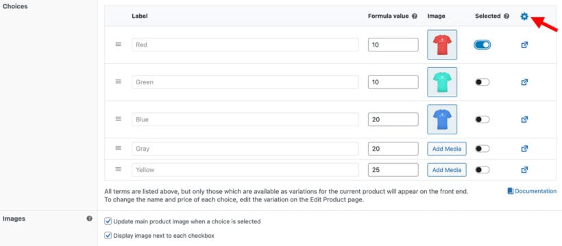
- Formula value - Optionally enter a numeric value for each choice which will be used by the price formula field. For example, in the above screenshot, we have assigned a numeric value to each t-shirt color which could be used to make price calculations.
- Image - Optionally add an image for each choice. This overrides the variation image, if set.
- Selected by default - Pre-select one or more choices, so that it will be added to the cart unless the customer manually removes it. This overrides the 'Default Variation' feature in WooCommerce itself.
Images
This section only appears for Image Button options, or for other types of option where you have displayed the 'Image' column in the list of choices (see above).
- Update main product image when a choice is selected - Enable this so that when the customer selects a choice, the main image on the single product page will be replaced with the image of the selected choice. The images from the buttons will also appear in the product gallery which most themes display as thumbnails under the main image.
- Display image next to each checkbox/radio button/etc. - Enable this to display a small image alongside each choice. For example, you can see this for the 'Fabric Color' radio buttons in the screenshot below. (Note: This option does not appear for Image Buttons because the images are essential.)

Image button and Product options
The following options will appear when you either add Image Button options, or when you're using the 'Products' option style and choose the 'Image Button' style.
Image width
By default, the images are 118 pixels square. The images will always be square, and you can change the size to anything you like by entering the required number of pixels.
Display
You can either display the images on their own, or you can display the name of each choice with the image. The options are:
- Display image buttons only
- Display label and image buttons
Note: If you have entered a price for a particular image choice, then this will always appear even if you have selected 'Display image buttons only'. This is because it's important for customers to know when selecting an option will affect the price, regardless of whether you are displaying any other text with the image.
Label position
You can choose a position and style for the text and price of each image option. The choices are:
- Full overlay (selected by default) - The image is covered with a semi-transparent overlay, and the name (plus price if available) appears on the overlay. Customers can hover to hide the overlay and view the full image.

- Full overlay on hover - The image is displayed without any text or a price, and customers can hover over it to overlay the image with the option name (plus price if available).
- Partial overlay - The bottom half of the image is covered with a semi-transparent overlay, and the name (plus price if available) appears on the overlay. Customers can hover to hide the overlay and view the full image.
- Above image - The name (plus price if available) appears above the image.
- Below image - The name (plus price if available) appears below the image.
Note: We have intentionally made the image overlays quite dark to ensure that your site meets accessibility guidelines for minimum color contrast. There is no option to increase the transparency of the overlay because this would cause your site to fail accessibility tests. Customers can hover over an image to remove the overlay and see the full image. If you want the image to be visible more clearly without having to hover over it, then we recommend using one of the options without an overlay.
Price formula options
Formula
Enter the formula for the price calculation using the syntax which appears underneath the field. Learn more.
Ignore main product price
Enable this to stop the main product/variation price from being added to the total price of the product.
For example, if you're selling fabric by the meter then you might want to set the basic product price as $25 in order to display it as "$25 per meter" on the product page - but you don't want $25 to be added to the final price when the customer inputs their actual dimensions.
You can still use the [product_price] parameter to manually add the main price to the formula. However, enabling this option will stop the main product page from being added to the results of the price formula automatically. This gives you greater flexibility in how (if at all) the main product price relates to the calculated price.
'Products' options
The 'Products' option type lets you select other products from your store to display as options. When you select this, several additional options appear:
Product selection
Choose how you will select which products appear as options:
- Select specific products - Choose individual products or variations which appear as options.
- Select products dynamically - Select a category and have products from this category selected dynamically based on certain criteria. To control which products are selected, you can choose:
- Limit - The maximum number of products from the category which can be displayed.
- Sorting - Choose whether to select products by Title, Price (highest), Price (lowest), Rating (highest), Rating (lowest), Date (newest), Date (oldest), or Popularity.
Display choices as
Choose from a range of styles for how the products will be displayed:
- Products - Show the products in an ecommerce-style format with an image, name, price, and button.
- Checkboxes - List the products as multi-select checkboxes.
- Radio buttons - Display the products as radio buttons. Customers can only select one at a time.
- Dropdown select - Show the products as a dropdown list. Recommended for saving space on the page.
- Image buttons - Show the products as clickable images, either with the product name overlayed over the top, or just the price.
Live Preview
These options only appear for file upload option types when the Live Preview add-on is installed.
- Enable live preview - This is enabled by default for all file upload fields, and disabled for text and paragraph fields.
- Preview button - This option appears when "Enable live preview" is ticked. Use it to customize the text link which appears on the product page allowing customers to re-open the preview. (Note: You can also set this text globally on the plugin settings page.)
Description
If you like, then you can add some descriptive text which will appear below the choices. For example, you might add useful instructions for your customers such as "Select up to extra 3 pizza toppings".
Display
This only appears for the Image Buttons and Color Swatches option type. Choose whether you want to display the image/color swatch on its own with no label, or whether you want to display the option name too.
Required
Tick this box to force customers to select at least one choice before they can add the product to their cart.
This field is hidden when you are displaying variation attributes as options because WooCommerce itself requires the customer to select one of each attribute, and this cannot be overridden by WooCommerce Product Options.
Advanced settings
Enable the toggle to view the advanced settings.
Choice restrictions
This is available for the checkbox, image button, and text label option types when you create the options directly in WooCommerce Product Options. It is not available when you display variation attributes as options because WooCommerce itself requires that only 1 of each attribute can be selected at a time.
Optionally enter the minimum and/or maximum number of choices which are required before customers can add the product to their cart.
Tips:
- The minimum and maximum do not automatically appear on the front end. If you wish to add this information as guidance for the customer (e.g. as a note saying: "Please select up to 3 extra pizza toppings.") then you should add this to the Description field (above).
- Minimum quantities are designed to be used to force customers to select more than 1 choice. Setting the minimum quantity to 1 will have no effect. If you want to force customers to select a particular option, then you should make the option required instead.
- These min/max quantity options only apply to your product options. If you want to set quantity rules for whole products, then you need our other plugin - WooCommerce Quantity Manager. This works nicely alongside WooCommerce Product Options.
Quantity pickers
This section only appears when 'Display a quantity picker alongside each choice' is enabled above. Use it to control the quantity picker that appears for each choice:
- Picker style - Choose a quantity picker style. Choose between a standard spinner-style picker, and a "stepper" which displays the quantity in the middle with plus/minus icons to the sides.
- Individual choice quantity limits - Optionally set a minimum and maximum quantity which customers can select for each individual choice. For example, if you're selling a snack box with checkboxes for each type of snack bar, then you should enter a maximum of 2 to prevent customers from adding more than 2 of the same snack bar to the box.
- Total quantity limits - Optionally set a minimum and maximum quantity of the combined choices for this option. For example, if a mix-and-match snack box can contain up to 10 items in total then enter the maximum as 2.
Note: These quantity picker options only relate to the individual quantity pickers that you can add to each choice. They are separate from the main quantity field which WooCommerce itself adds to the overall product.
Character limits
This is only available for the Text Input and Paragraph option types. Optionally enter the minimum and/or maximum number of characters which customers must enter before they can add the product to their cart. For example, if you're selling a bracelet with a custom engraving option then you should enter a maximum of '10' is there is only space for 10 letters.
Maximum file size (MB)
This is only available for the File Upload option type. Optionally enter the maximum size in megabytes for each file that users can upload.
Further information: Where are uploaded files stored?
Maximum number of files
This is only available for the File Upload option type. By default, users can upload 1 file. Increase the number to allow them to add multiple files.
Allowed file types
By default, the file types which are allowable on your overall WordPress site are listed here. Add and remove file extensions to allow users to upload specific types only, e.g. jpg or pdf.
Notes:
- File extensions are not case sensitive, so you can enter JPG or jpg.
- You can only enable file extensions which are supported by your overall WordPress install. WPBeginner have provided a useful article on how to change the allowed file types in WordPress.
Hide prices
Enable the 'Do not display option prices on the product page' checkbox if you have added prices to your product options but do not wish to display the price alongside each choice. The price of the selected options will still be added to the total price.
Conditional logic
Use this to dynamically show/hide product options depending on which other product options or variations the customer has selected. For example:
- If you're adding a 'Gift wrap' option to a product, then you might create a 'Ribbon color' option which only appears when 'Gift wrap' is selected.
- You might want to display an 'Upload your logo' field on a t-shirt product when adult size variations are selected, but not child size variants.
- You can add conditional logic to the price formula field in order to use different price calculations depending on which other options are selected.
The 'Condition' dropdown lists all the other options from the current option group, plus all the global attributes from Products → Attributes. Select attributes to show and hide options based on which product variations are selected. (Note: It is not possible to do this for product-specific variations which are created directly on the 'Add/Edit Product' screen.)
Add conditional logic rules with the exact logic that you require, and use the + button to add multiple rules.
Warning: If you are displaying variation attributes as option then we recommend that you do not use conditional logic to hide these attribute choices. Due to the way WooCommerce works, variable products can only be added to the cart if the customer has selected one of each attribute. As a result, an error will appear if the user tries to add a product to the cart without having selected all the attributes (which they can't do if they are hidden!).
Date options
Selection options
- Disable past dates - Greys out all dates in the past so that they cannot be selected.
- Disable future dates - Greys out all dates in the future so that they cannot be selected.
- Disable today - Prevents customers from selecting the current day.
- Enable time - Displays a time picker on the calendar, so that customers can choose a date and time.
Disable days
Use this option to select specific weekdays which will always be greyed out. For example, if you are closed every Sunday then you would click in the box and select Sunday.
Date format
Changes the format of the selected date. Learn more.
Date limits
Enter the earliest and latest possible date which will be available on the calendar. Learn more.
Disable dates
Mark specific dates as unavailable, for example if you are closed over a holiday period. Learn more.
Time limits
Enter the earliest and latest possible date which will be available on the calendar. Learn more.
Time increment
Control the length of time for each available time slot (e.g. 30 minutes). Learn more.
Custom CSS class
This option is aimed at developers. If you have created a custom CSS class to change the styling of the product options, then enter it here to apply it to the appropriate option. Do not include the dot.
View and display your product options
And that's it! Once you have added all your product options, we recommend checking how they look on the front end of your website. Keep tweaking until you're completely happy.
By default, the product options will appear on the individual product pages. To maximize your sales, you can use our other plugins to display them in exciting locations elsewhere on your site - for example:
- In product tables, so that customers can select options from the product list view without having to visit individual product pages.
- In a quick view lightbox, directly on the Shop homepage.
- In a restaurant food order form.
- In a bulk variations grid.
- In an on-page popup cart.