Crafting responsive tables in WordPress: a rundown

Responsive website tables automatically adjust to fit different screen sizes, so that they're easier for web visitors to read and navigate — regardless of the available screen space. In this detailed guide, I'll show you two quick and easy methods to add WordPress responsive tables to your site.
I've seen several versions of these questions from both new and veteran WordPress users:
- Can WordPress tables be made responsive?
- How do I make a table responsive in WordPress?
- How do I create an interactive table in WordPress?
- How do I create a dynamic table in WordPress?
If that's what you're looking for, I have some good news for you. It's totally possible to build responsive tables in WordPress, and there's more than one way to do so.
In this detailed tutorial, I'll show you two simple, no-code methods to add responsive tables to your WordPress site:
- With Posts Table Pro: This is a powerful WordPress table builder plugin that lets you create manual and dynamic tables that can contain a huge amount of data in minutes.
- With Gutenberg Blocks: This uses WordPress's native table Block functionality to add manual responsive tables to your site. Note that this method only works with responsive WordPress themes.
Both methods are super beginner-friendly, so you can easily follow along — no HTML, PHP, JavaScript, or custom CSS code knowledge required.
Are you ready? Let's begin with a quick overview of what WordPress responsive tables are.
What are responsive tables in WordPress?
Similar to adding huge chunks of data to an Excel file or Google Sheet, the table format is great for presenting large amounts of data on a website. Think: Product comparisons, product features, pricing tables, addresses, statistics, inventory counts, schedules, blog posts, etc.
In WordPress, responsive tables automatically adapt and adjust their layout and appearance based on the screen size of the device being used to view a website.
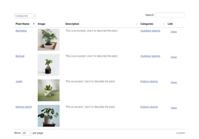
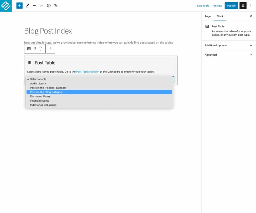
For context, here's how a responsive table (created with the Posts Table Pro plugin) looks on the front end of a site:
Responsive tables are vital because they ensure that your site looks good and functions well on all devices, whether it's a desktop computer, a tablet, or a smartphone. If the data tables aren't responsive, your site might appear broken or hard to read on smaller screens.
Why are responsive tables important for WordPress sites?
For instance, let's say you run a tech review site like GSM Arena, and you want to showcase product specifications of each tech gadget. On a desktop screen, the data table might be displayed with all columns visible and neatly organized. However, on a smartphone, the same table might rearrange its columns, stack them vertically, or even hide some of the less important columns to make sure that the essential information remains visible without requiring excessive horizontal scrolling or zooming.
Responsive tables ensure that the content within them remains readable and accessible across all devices, no matter their screen size. This means that your web visitors won't have to zoom in or scroll to view the entire table, making it great for your site's SEO and overall user experience (UX).
Types of responsive tables in WordPress
There are two types of responsive tables: manual tables and dynamic tables.
- Manual responsive tables: Manual tables require you to manually input the data and adjust its structure. You can control over the table's appearance, specify the number of rows and columns in the table, as well as the content within each cell. Gutenberg 'table' block lets you create manual tables.
- Dynamic responsive tables: Dynamic tables use data stored in your WordPress site’s database and automatically update and adjust their content based on changes to the underlying data. This means that if the data gets updated, the table automatically reflects the changes — zero manual updates required. The Posts Table Pro plugin lets you create both manual and dynamic tables.
As you might imagine, there are pros and cons to each responsive table type.
Creating manual tables is super straightforward, and you can create them using WordPress's Gutenberg editor. However, they require manual updates whenever there are changes to the data. So if you frequently update your content or have a large amount of data, this can quickly become time-consuming and tedious. Plus, because changes and updates are manually implemented, it can lead to inconsistencies or errors if not managed carefully.
On the other hand, dynamic tables take a few more initial setup steps to create, because you have to use a plugin. However, they are often better because the data in the tables are automatically updated when you update the sources.
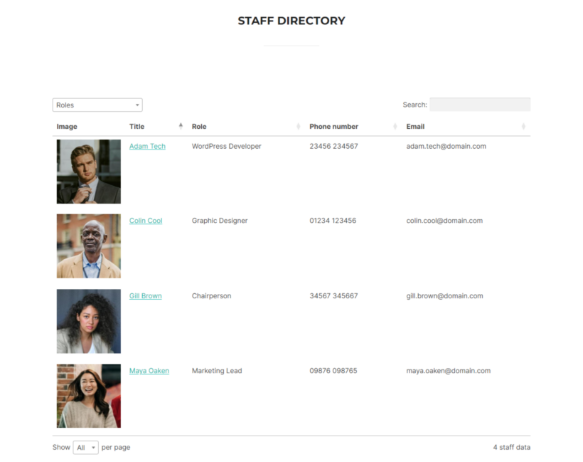
Also, if you create the dynamic tables using Posts Table Pro, it’ll also create dedicated pages for each item in the table, which people can access by clicking on the title or image. For instance, if you created table showcasing staff in your company, then when people click on the title for each staff member, it’ll open the standalone page with lots of information about each of them.
Building responsive tables in WordPress with Posts Table Pro
Posts Table Pro is an easy-to-use plugin that lets you create highly responsive, dynamic tables that contain data stored on your WordPress website. It lets you present various types of data, including posts, products, pages, audio, videos, documents, custom fields, etc., in beautiful tables that automatically update when their content is added or changed.
With Posts Table Pro, you can create as many responsive tables as you want. There's also no limit to the amount of content you can showcase in each table.
It's suitable for a wide range of use cases — member directories, document libraries, blog post indexes, ebook libraries, audio and video galleries, and much more. Plus, you can add a search box as well as sort and filter options to make it even easier for people to find the specific data they want.
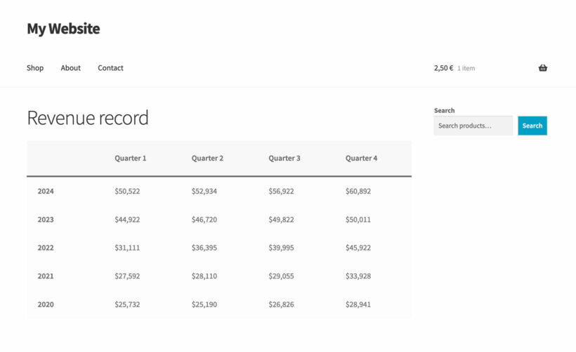
Here's an example of how a responsive table created with the Posts Table Pro plugin looks on the front end of a site:
Posts Table Pro's key features
- 100% responsiveness: Its tables automatically adjust the layout and contents to match the available screen space — no matter if the user is using a desktop, laptop, tablet, mobile phone, or anything in between.
- Table content: You can customize your tables, its headers, and the table design however you like. Add fields that contain various types of content, including titles, images, content (text, embedded audio and video), excerpts, dates, buttons, categories, tags, statuses, custom taxonomies, custom fields, etc.
- User navigation: You can add a search box, sort options, reset button, filters, page length dropdown, post totals, and pagination buttons to make it easier for users to navigate the tables.
- Content priority: You can drag and drop columns to assign priority to them and specify which ones to hide in case there are too many and they can't fit on the screen. Note that if columns are hidden, the plugin adds a + icon which customers can click to expand the table and view the content.
- Column breakpoints: Breakpoints are specific screen widths at which the layout or table styling changes to accommodate different devices. You can define breakpoints to control the columns to hide or show on various device sizes. Note that customers can still view the hidden columns by clicking a + icon.
- Responsive display: You can opt to hide or present hidden columns or open them with a modal page.
How to build WordPress responsive tables with Posts Table Pro
Follow these steps to configure Posts Table Pro and add responsive tables to your WordPress or WooCommerce site.
1. Create the data to be displayed in the responsive table
1.1: Add custom post types with custom fields and taxonomies (optional)
Note: Skip this section and go to step 2 if the data that you want to display in a table already exists on your WordPress site.
As I mentioned earlier, Posts Table Pro lets you showcase various types of data on your website, including custom post types. If you're not familiar, custom post types in WordPress allow you to create and manage different types of content beyond the standard posts and pages. This enables you to organize and display diverse types of information on your website in a structured manner.
For instance, let's say you want to create a staff directory section on your WordPress site. Instead of trying to fit all the staff information into standard posts or pages, you can create a custom post type with unique fields and taxonomies specifically for staff members. This will add a dedicated 'Staff' section to the WordPress admin.
Some plugins create their own custom post types, which you can display in a responsive table using Posts Table Pro. For example, if you're using an events or e-commerce plugin then it will create an 'Events' or 'Products' post type. Or if you're not using a plugin to create the data, then you need to create your own custom post type.
The free Easy Post Types and Fields plugin makes it easy to create a WordPress custom post type:
- Go to Plugins → Add New, search for 'Easy Post Types and Fields' and install it on your site.
- Navigate to the newly added “Post Types” tab.
- Click on Manage → Add New.
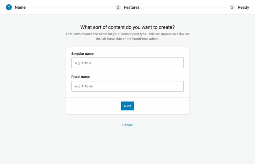
- Enter singular and plural names for the custom post type.
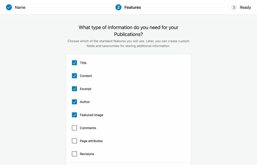
- Select the parameters of information you want to showcase in the post type and click on "Create".
- You’ll now see a new tab for the new custom post type in your WordPress admin menu.
Add custom fields and taxonomies to the custom post types
Next, it’s time to add custom fields and taxonomies to your custom post type. Custom fields are the static data to be displayed in the custom post types. Custom taxonomies are filterable — visitors can use them to sort through the data in the table. Continue with the example of the staff directory, you can add email addresses and phone numbers as custom fields. Roles will be custom taxonomies.
- To add a custom field, navigate to Post Types → Manage in your WordPress admin and select the Custom Fields option for the post type that you wish to update.
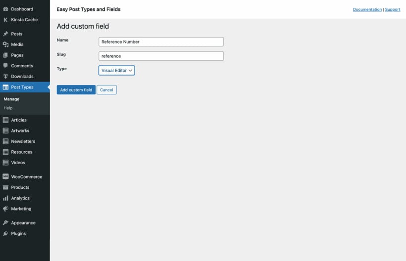
- Select Add New to create a new custom field for that post type. Add in the name and slug, and specify your preferred the field type (visual editor or text).
- Then click on the Add custom field button to save the changes.
- Rinse and repeat to add more custom fields as needed.
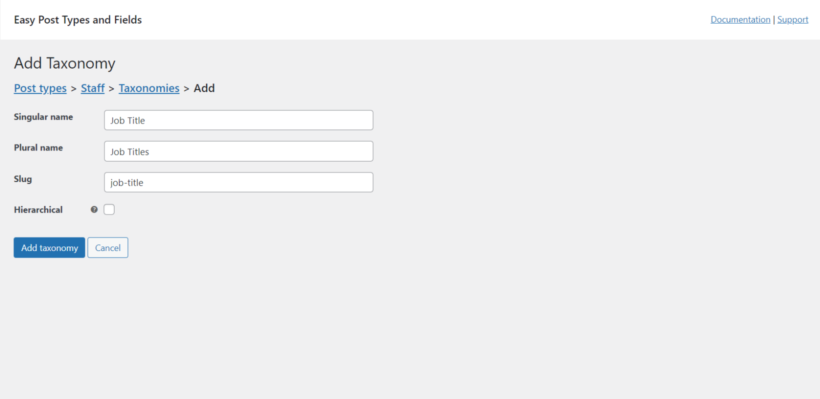
- To add a custom taxonomy, navigate to Post Types → Manage in your WordPress admin and select the Taxonomies option for the post type that you wish to update.
- Select Add New to create a new custom taxonomy for the post type. Add in the singular name, plural names, and the slug. Then click the Add taxonomy option.
- Rinse and repeat to add more custom filterable taxonomies as needed.
2. Add Posts Table Pro and configure its core settings
Now the data exists on your website, it's time to create your first responsive table in WordPress.
The first step is to add the plugin to your site and configure its setup wizard.
- Get the Posts Table Pro plugin (premium version only). Then install and activate it on your site.
- The setup wizard automatically opens once it's been activated. That's where you can set up the responsive table.
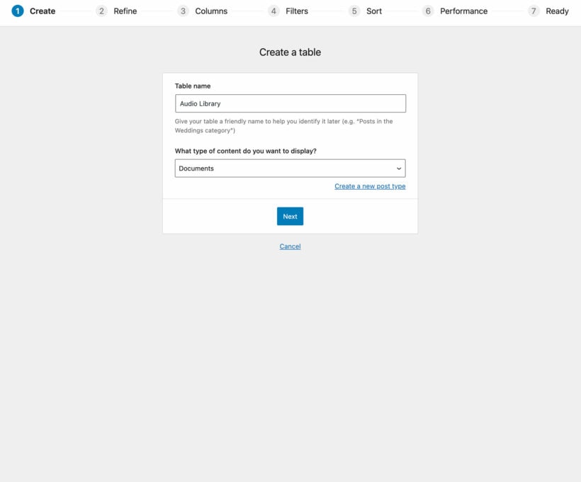
- Name your table (note that this is for internal view only). Then, specify the type of content you wish to display in the table — posts, pages, media, products, documents, custom post types, etc.
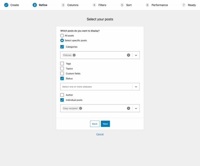
2. Specify the data to be added to the dynamic table
If you want to display specific posts (or custom posts) only, then you can choose exactly what to display. For example, you might only want to display data with a particular category or taxonomy term.
3. Configure your responsive table columns
- Next, choose which columns to add to the responsive table. You can basically add a column for each piece of data which exists for your post or custom post. Keep in mind that the options you see here will be based on what you selected in the previous step.
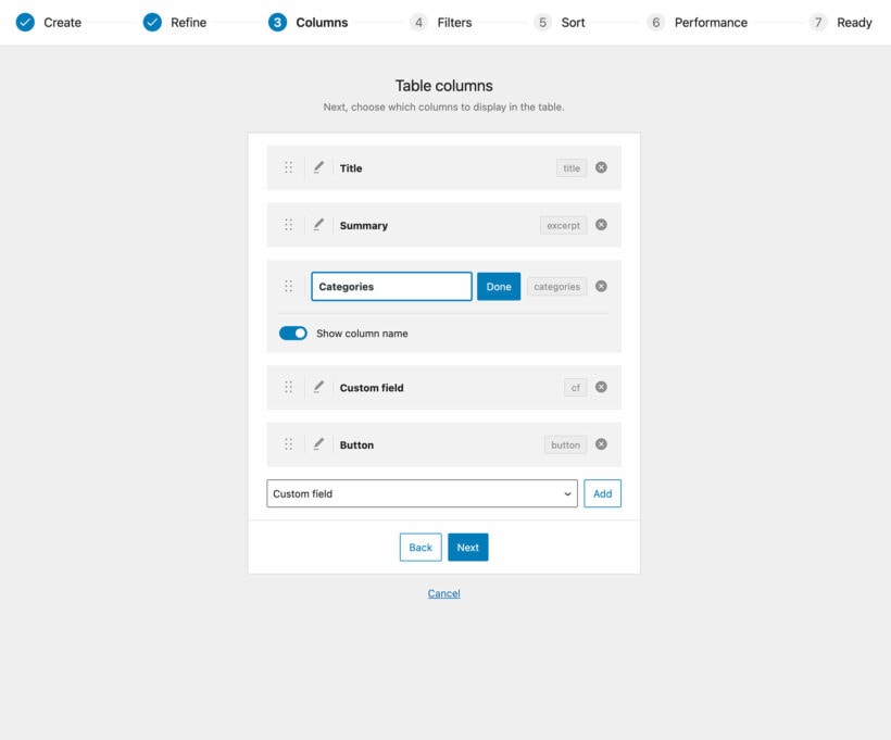
- Now, it's time to choose the specific columns to be shown in the table.
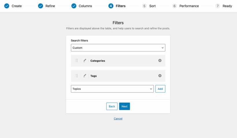
- You can add filters to make it easier for people to find specific content in the table. The filters are shown as dropdown menus right above the table, and you can add an unlimited number of filters. Again, the options on this screen will be based on the post type you chose in step 4.
- If you plan to display a huge amount of content, select lazy load. If not, skip it.
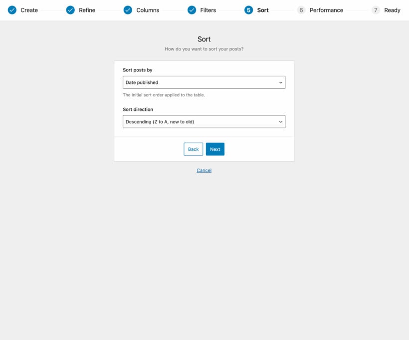
- Next, choose sort parameters and the sort direction for the items in the table. Then, go to the next screen.
- Copy the responsive table shortcode. In the next step, I'll show you how to add the table to your site.
4. Insert the responsive WordPress table on your site
For this tutorial, I'll add the table to a standalone page. However, you can add it anywhere else — in a widget, to the sidebar, in the middle of a post, etc.
- Go to Pages → Add New Page.
- There are multiple ways to add it:
- Paste the shortcode you copied in the previous step into the content editor.
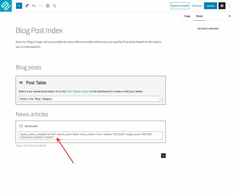
- Or if you're using Gutenberg, select the "Posts Table" block and add the shortcode to it.
- Paste the shortcode you copied in the previous step into the content editor.
That's it! You can now head to the front end of your site to view your responsive table.
Pro tip: Use the mobile emulator tool to view your responsive tables on small screens.
3. Additional customizations using Posts Table Pro
This section is completely optional. But I want to show you how you can amend the shortcode to customize your table even further.
By default, the tables Posts Table Pro creates will automatically be responsive, but you can add parameters to the simple table shortcode generated above to define its behavior as needed. Here are a few extra things you can do:
1. Wrap
By default, the HTML tables wrap long content into multiple lines, as needed. But you can choose to keep it as a single line and hide the rest of the content. This makes sure that each table row and content is exactly one line high.
2. Priorities
In cases where the screen is too large or too small for the columns, the table will collapse some columns and add a plus (+) sign to give users the option to expand them.
Adding priorities specifies which columns to collapse and which to leave open. The shortcode lists the available columns, followed by their priorities. For example, a table that has the following six columns: ID, title, categories, content, author, and button, where the priority is as follows: title, content, author, categories, button, and ID.
3. Column breakpoints
Posts Table Pro will show or hide columns depending on the priorities above (or the default setting unless otherwise specified). You can add more specific breakpoints, like:
- Desktop - The column will only appear expanded on desktop screens.
- Tablet - The column will only appear expanded on tablet screens.
- Mobile - The column will only appear expanded on mobile screens.
- All - The column will always appear visible, no matter the screen size.
- None - The column will only appear in a child row or modal window when expanded.
- Default - This lets the plugin decide based on the default options or the priorities you set.
4. Responsive control
This sets whether the plus (+) icon to expand information is shown inside the column (responsive_control="inline") or in a separate column (responsive_control="column").
5. Responsive display
This specifies how child rows are displayed and behave in the table.
Child_row: The default option. Extra data will be displayed in a hidden child row.Child_row_visible: Extra data is displayed in a child row which is expanded automatically when the table is first viewed.Modal: Extra data is displayed in a modal window when the “+” icon is clicked.
Head to the front end and check your website using the mobile emulator tool.
Building responsive tables in WordPress with Gutenberg
WordPress's native Gutenberg Editor allows you to add manual responsive tables to your site using its built-in table block. As long you're using a WordPress theme with a responsive design (as most sites are these days), the table will automatically reformat and readjust its breakpoints based on web visitors' screen sizes. However, because it's a manual table, the content you showcase in it won't update automatically.
A quick note: Gutenberg automatically ensures that the tables you create are responsive by default. However, you'll have limited options in terms of how it reformats itself for different screen sizes and you won't be able to fine-tune how the tables behave like you can when you use Posts Table Pro.
How to build WordPress responsive tables using the Gutenberg Block Editor
Follow these steps to create manual responsive tables in WordPress with Gutenberg:
- Head to your site's admin panel and open up the post or page where you want to add the responsive table.
- Click on the "+" icon or the "Add Block" button inside the content editor.
- Search for the "Table" block and click on it to add it to your post/page.

- The table block adds an empty table with rows and columns. Click inside each cell to add text, images, or any other content you want to display in the table.

- Add as many rows and columns as you need to enter your data into the table.
- Select the table block to open up the block settings on the right sidebar. This is where you can customize the alignment, background color, text color, and other aspects of the table.
- Once you've finished adding content and customizing the table settings, click on the "Publish" or "Update" button to make your changes live on your site.
That's about it! Here's the front end view on a website:
Gutenberg automatically ensures that the tables you create are responsive by default. There's no need for additional configuration to make the table adapt to different screen sizes—it happens automatically as users view your website on different devices.
Pro tip: Use the mobile emulator tool to view your responsive table on different screen sizes.
Tips for making user-friendly responsive tables
Creating responsive tables in WordPress isn't just about making sure they fit on any device screen. It's also about making them user-friendly and accessible. Here are actionable tips for creating tables that are both functional and convenient for your site's visitors:
Prioritize readability
It's vital to make sure that your site's visitors can easily read and understand the content in your tables. Using a larger font size, especially on smaller screens like mobile devices ensures that people don't strain their eyes trying to understand the information. In addition, you can increase the padding between cells to provide visual breathing room and make it easier to focus on each cell without feeling overwhelmed.
Don't overcrowd the tables
Adding too much data can make it difficult for people to navigate each table, especially on mobile devices where screen space is limited. Posts Table Pro lets you prioritize the content to be shown in each table. You can use modal windows and child rows to showcase supplementary information without cluttering the main table view.
Maintain consistent web design
You don't want your table to seem out of place on your website. Maintain the same look and feel for tables across different screen sizes to avoid confusing people and provide a seamless user experience.
Set breakpoints for column visibility
Breakpoints help make sure your tables remain user-friendly across different screen sizes. With Posts Table Pro , you can use shortcodes to set breakpoints and specify which columns should be visible at various screen widths.
Optimize tables performance
Slow-loading tables can frustrate users and lead to a negative user experience (UX). If your table (or even your site in general) contains a large amount of data, you need to implement additional performance optimization tactics. Unlike page builder plugins, Posts Table Pro is super lightweight. It also has built-in AJAX filtering and lazy loading to improve table performance and loading times. AJAX filtering lets people filter table data dynamically without reloading the entire page. Lazy load ensures that table content is loaded progressively as users scroll down the page, which reduces initial load times. Both result in a reduction in page load times and improve the overall performance, especially on pages with multiple tables or huge data sets.
Create WordPress responsive tables today!
The table format is excellent for showcasing short pieces of information in an easy-to-digest way. However, if they aren’t designed and formatted with mobile optimization in mind, they can be really difficult for people accessing your site via phones and tablets.
In this guide, I've shown you the best ways to add manual and dynamic responsive tables in WordPress:
- With the Gutenberg Block Editor: This uses WordPress's built-in 'table' block to add basic, manual responsive tables to your website. Note that you must be using a responsive WordPress theme to use this method.
- With the powerful Posts Table Pro (recommended): This is the best WordPress table plugin. It creates 100% responsive, dynamic tables that can contain posts, pages, products, audio, videos, images, documents, custom fields, and various types of data. You can also add a search box, sort and filter options, post totals, reset and pagination buttons, and page length dropdowns to make it even easier for web visitors to navigate the tables and access their data.
Posts Table Pro lets you create tables with virtually any type of data in minutes. Plus, it is dynamic — meaning that the table automatically updates the data in it.
Get the Posts Table Pro plugin and start building responsive tables today!