2. Quick View settings page
The WooCommerce Quick View Pro plugin settings page (WooCommerce → Settings → Products → Quick view) lets you control the appearance and content of the quick view.
You can also configure the main settings in the plugin setup wizard, which opens when you first activate the plugin and can be relaunched from the settings page.
The following video provides full setup instructions, including information about all the settings. You can also read about each setting below:
License key
Enter your license key here. This is essential for the plugin to work.
Options
Shop Display
These options control how customers can open the quick view lightbox from the WooCommerce shop page, product archive pages (e.g. product categories), and WooCommerce Gutenberg blocks. You can select one or both options:
- Show a Quick View button for each product - depending on your theme, this option adds a button or link immediately before the add to cart button.
- Display Quick View button on hover - when a customer hover overs a product image, they will see a quick view button towards the bottom of the image.
- Open the Quick View by clicking the product name or image - this option enables customers to open the quick view by clicking on the product name or image.
Note: The 'Hover' and 'Clicking the product name or image' features will only only work in themes that follow the standard WooCommerce conventions. Use the preview links to check whether they will work in your theme before enabling them on the live site.
Button text
This option controls the text that appears in the quick view button.
For example, you may wish to reword it to 'View', 'Customize' or 'Show Gallery' depending on how you are using the quick view.
Button icon
Tick this box to display a quick view 'eye' icon in the button.
If you tick this box and add button text in the field above, then the button will contain an icon and the text. If you tick this box and leave the 'Button text' field blank, then the button will only contain an icon and no text.
Quick view content
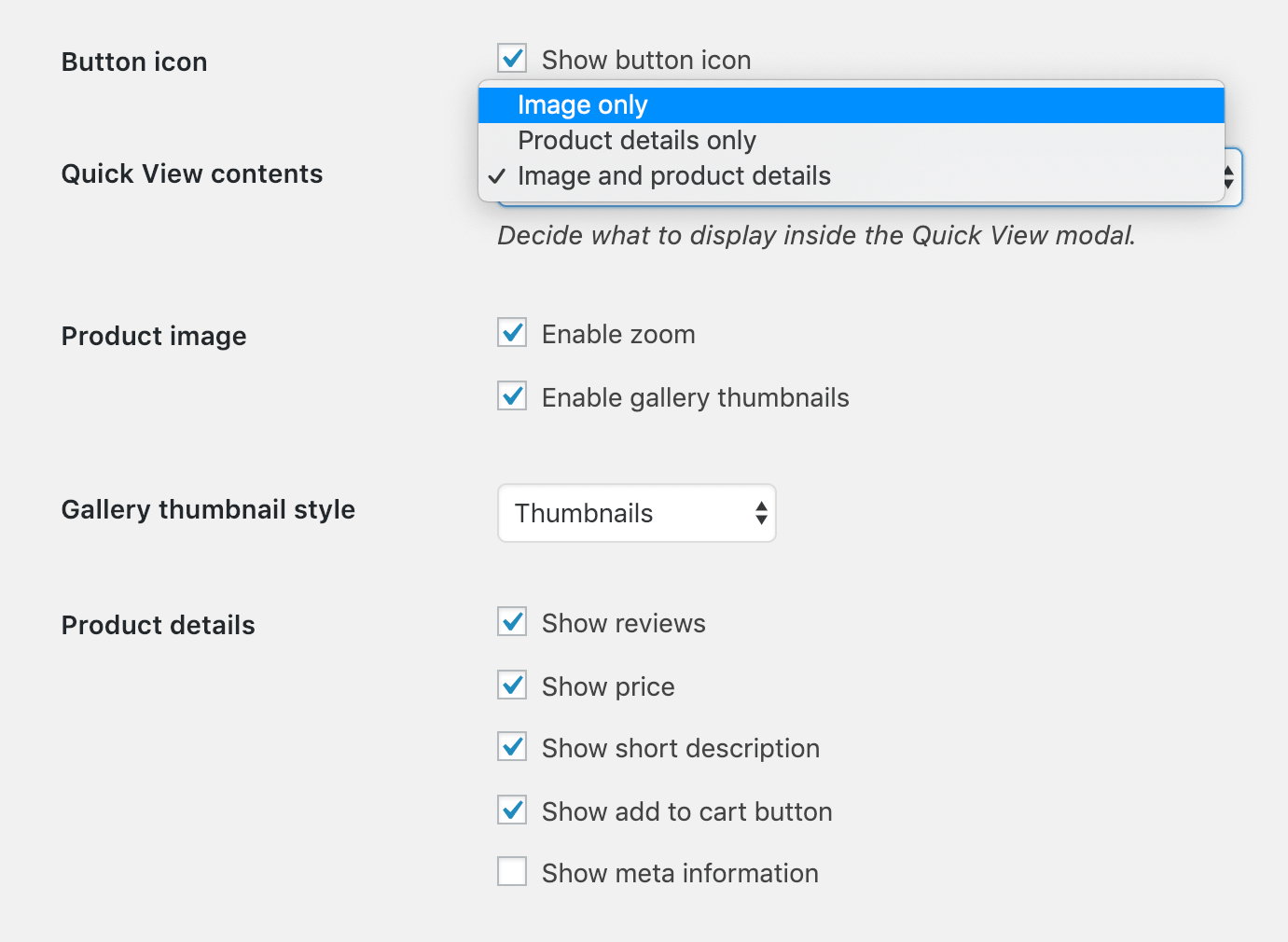
This dropdown lets you control the overall layout of the quick view lightbox:
- Image only - Select this option if you only want the quick view lightbox to show the product featured image, plus any additional images if you have enabled the gallery. This is a good option if you simply wish to display larger images or multiple images in a lightbox, without including extra information about the product or purchase details. For example, a photographer might combine this option with the 'Open from product name/image' option above to show bigger versions of the images they are selling.
- Product details only - Select this option if you want the quick view lightbox to show extra product information or purchase options, without any images. This is a good option if you're selling non-visual products that don't rely on big images.
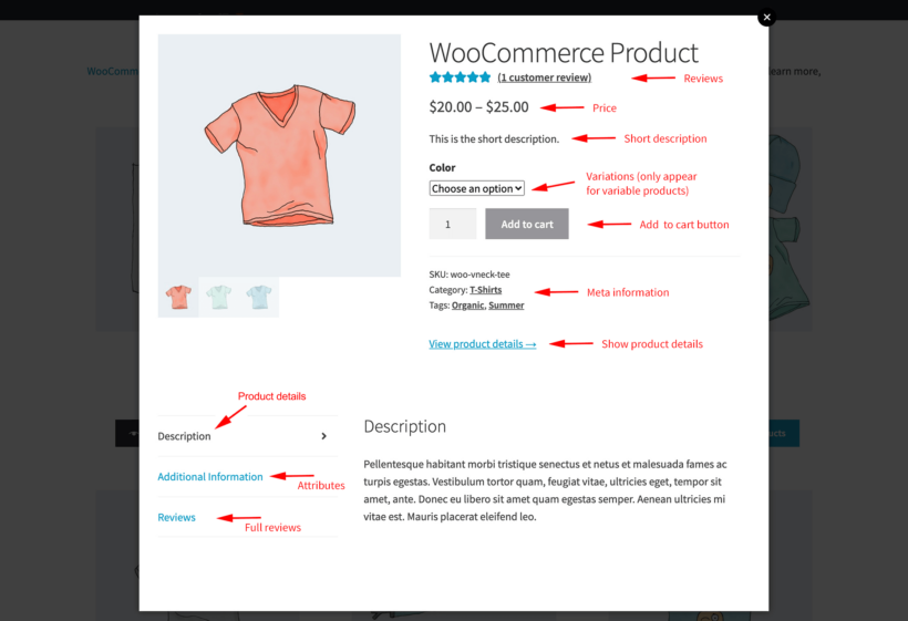
- Image and product details - This is the most popular option and replicates the top part of the single product page in a typical WooCommerce store. On desktop layouts, the product image(s) appears on the left and the product details appear on the right. On small screen sizes such as mobiles, the layout will stack and the image(s) will appear at the top, with the product details underneath.
Note: If you are using certain third party plugins, then content added by those plugins may also appear within the quick view lightbox. For example, we have integrated WooCommerce Quick View Pro with our other plugin, WooCommerce Lead Time. As a result, if you have added product lead times then these will appear in the quick view lightbox. You can learn how to add product lead times here, or find the list of compatible plugins here.
Product details
Tick as many boxes as you like to control which information to include in the quick view. They only apply if you have enabled 'Product details' or 'Image and product details' above:
- Show star ratings - Displays the average star rating along with the number of reviews for the current product, with a link to read reviews in full on the single product page. (Note: Only appears for products that have reviews.)
- Show full reviews - Adds a tab to the bottom of the lightbox containing the full content of all the reviews for the current product.
- Show price - Displays the product price underneath the name and reviews.
- Show short description - Displays the product summary/short description that you entered at the bottom of the 'Add/Edit Product' screen. (Note: This is different from the long product description, which is not designed to appear within the quick view lightbox.)
- Show full description - Displays the main product description in a tab to the bottom of the lightbox.
- Show add to cart button - Displays an add to cart button in the quick view lightbox, along with other purchase-related information such as the quantity picker, variations, and any additional options (if you are using the Product Options extension). (Note: This will only appear for products that are purchasable in WooCommerce.)
- Show meta information - Displays meta information about the product at the bottom of the quick view lightbox. This depends on the product and can include information such as categories, tags and the product's SKU code.
- Show attributes - Adds a tab to the bottom of the lightbox containing the attributes for the current product.
- Show product details link - Adds a link to the single product page. This appears underneath the add to cart button and meta information, if present.
- Show previous/next arrows - Displays previous and next buttons to the left and right of the product lightbox, so that customers can scroll between multiple products without closing the lightbox.
 Product image
These options control the behavior and content of the product images in the quick view. They only apply if you have enabled 'Image only' or 'Image and product details' above:
- Enable image zoom - Allow customers to zoom in to view a close-up version of the image when they hover over it. Note: The zoom will only work if the product image files are larger than the image size shown in the quick view.
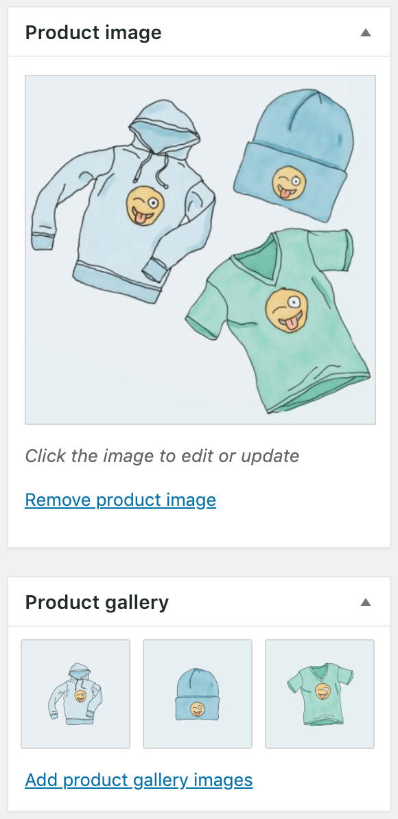
- Enable gallery thumbnails - If you have uploaded images to the product gallery section of the 'Add/Edit Product' screen (as shown in the screenshot), then this option will display the thumbnails of the other gallery images underneath the main product image in the lightbox. Customers can click on a gallery image to view a bigger version of it above.
Gallery thumbnail style
These options control how customers can navigate between the product images. They are only used for products that have multiple images.
- Thumbnails - Display the additional images underneath the main product image, so that customers can click on a thumbnail to switch image.
- Bullets - Display one image at a time, with bullets over the bottom of the image which customers can click to switch to the other images.
Keep open
By default, the quick view lightbox closes when customers add a product to the cart. Use these options to keep it open for simple and/or variable products.