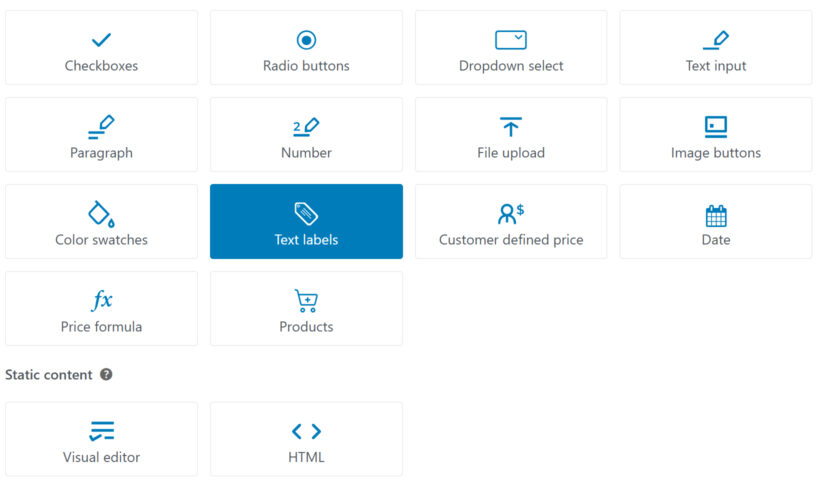
All available option types in WooCommerce Product Options
WooCommerce Product Options lets you add flexible, customizable options to your product pages so customers can personalize what they're buying.
You can choose from a wide range of option types depending on the kind of input you need, whether it's simple text, file uploads, selectable choices, or advanced pricing logic. We'll walk through each option type, starting with the most commonly used ones:
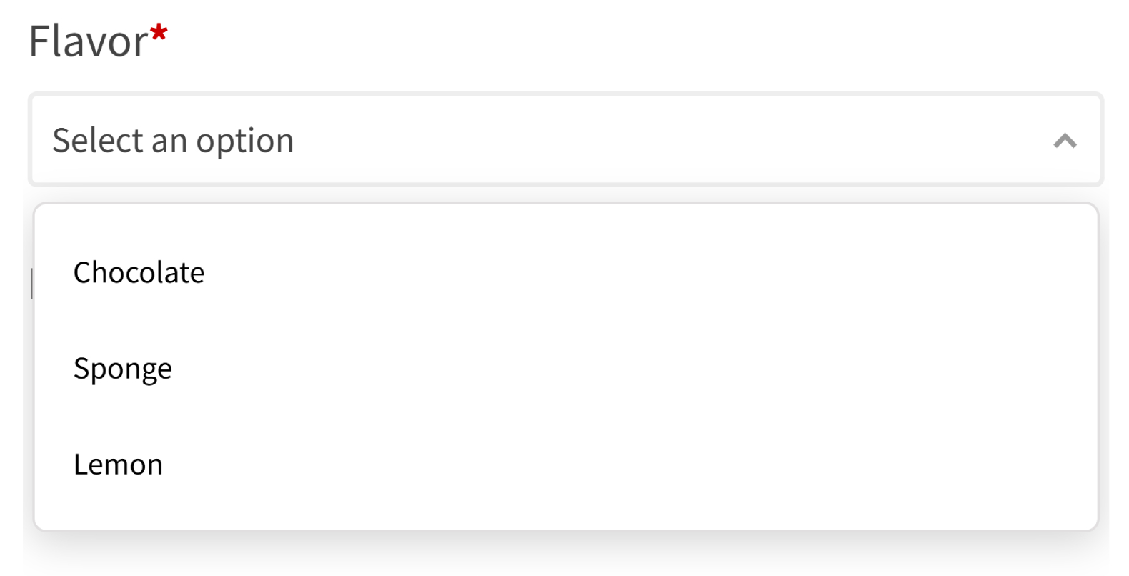
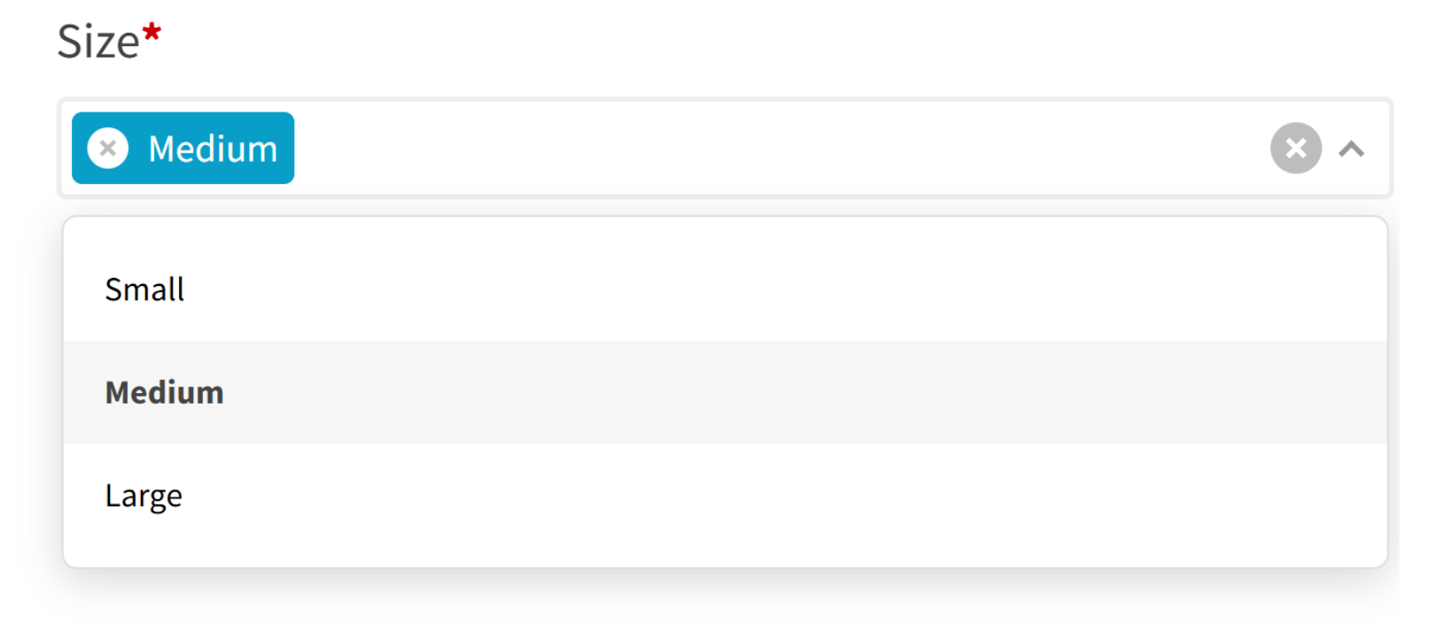
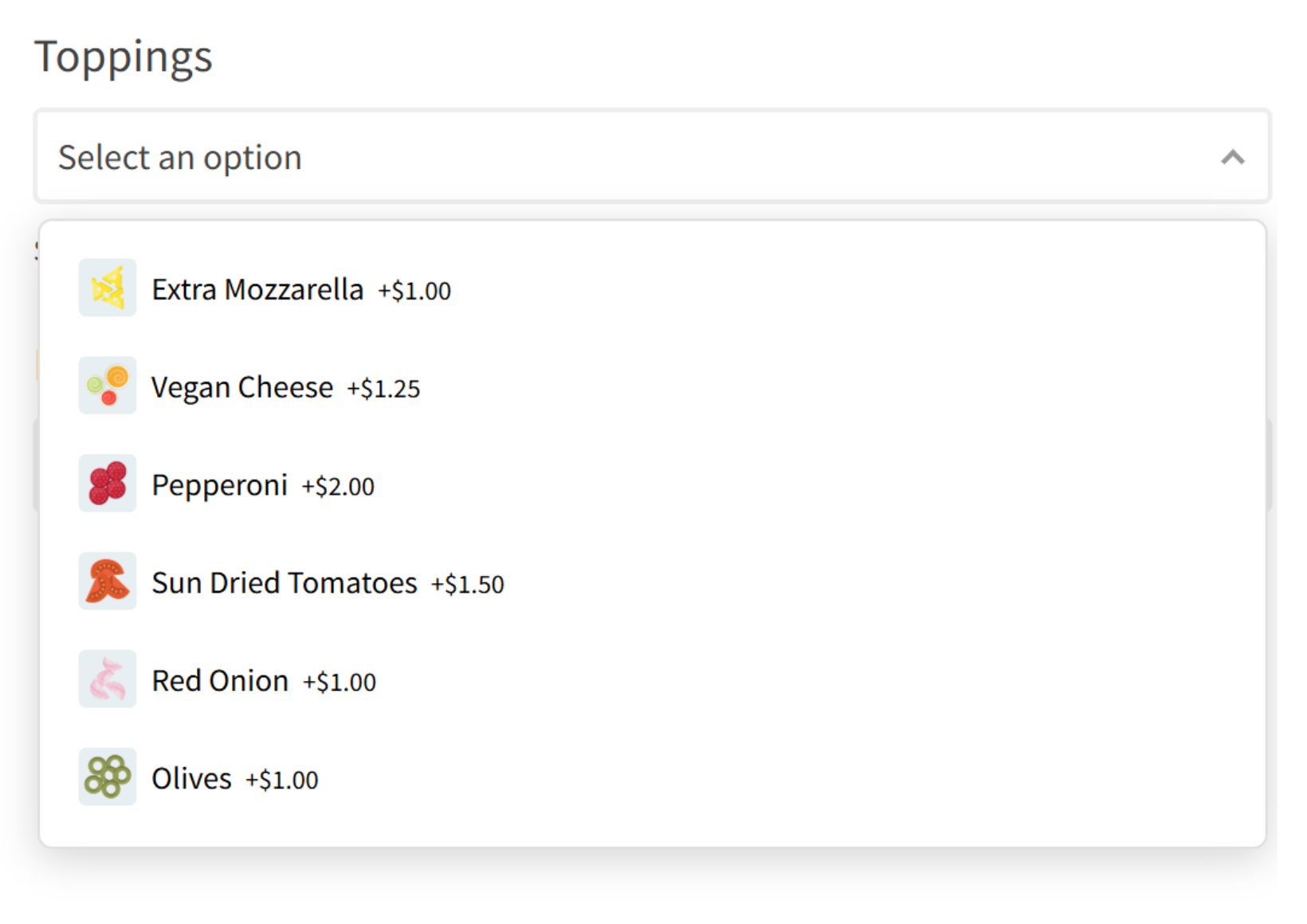
Dropdown select
Display a dropdown list of options. Customers can select one by default - to enable multi-select, either delete or change the maximum quantity.
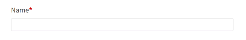
Text input
This field lets customers enter a single line of text. It’s commonly used for names, short notes, or personalization.
Tip: You can enable a live preview for text entered by customers using our Live Preview add-on. This is useful for personalized products such as names, initials, or short messages, allowing customers to see exactly how their text will appear.
File upload
Customers can upload files directly from the product page. This is useful for custom designs, logos, or documents.
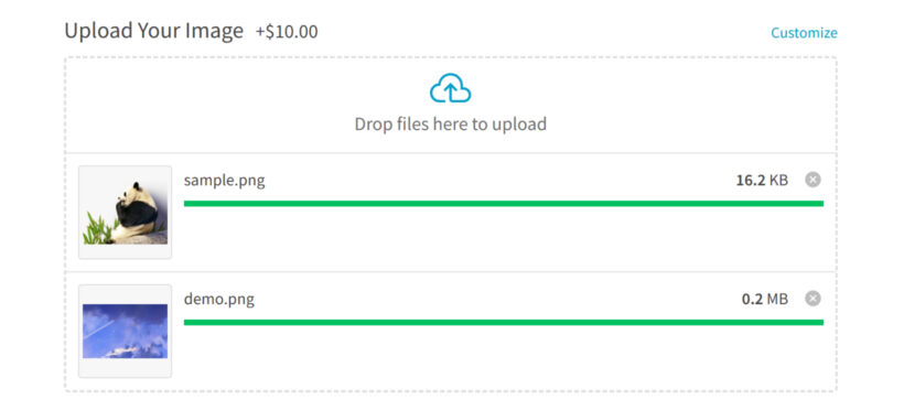
Tip: You can allow customers to preview how their uploaded image will look on the product by using our Live Preview add-on. This displays the uploaded file directly on the product preview in real time, helping customers confirm their design before adding to cart.
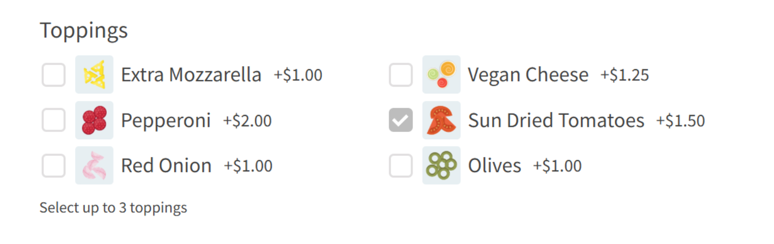
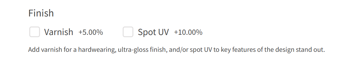
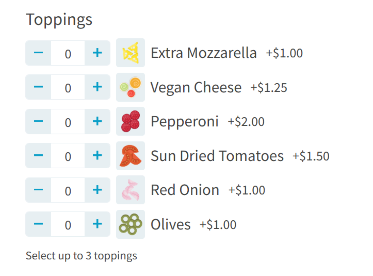
Checkboxes
Checkboxes allow customers to select one or more items. Perfect for add-ons or optional extras.
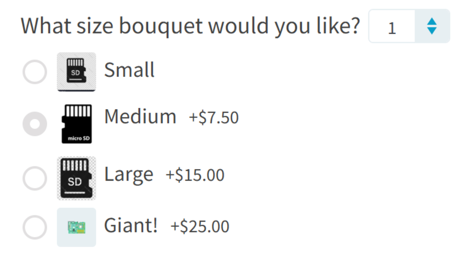
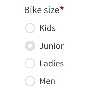
Radio buttons
Radio buttons let customers select exactly one item from a list, with all choices visible.
Price formula
This advanced option calculates prices dynamically based on user input or other options.
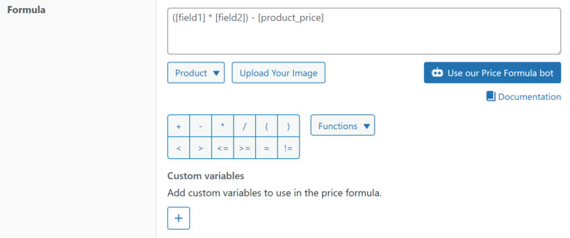
Learn more about creating price formulas here.
Number
Customers can enter a numeric value, often used for quantities, measurements, or custom amounts.
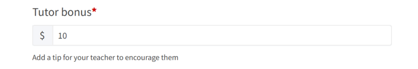
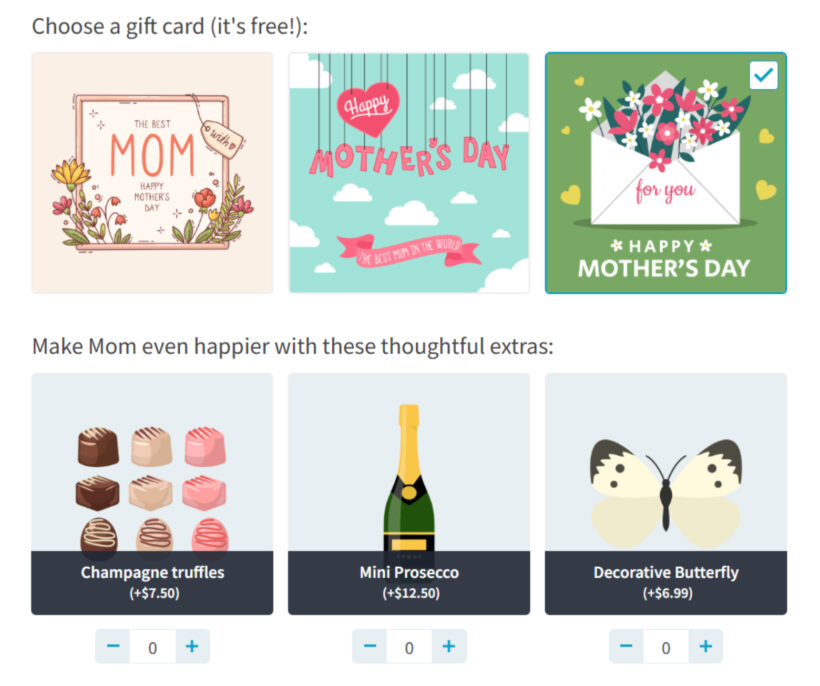
Image buttons
This option displays choices as clickable images instead of text, improving visual selection.
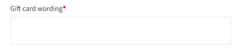
Paragraph
A multi-line text field for longer input, such as detailed instructions or messages.
Tip: You can also use the Live Preview add-on to display the entered content directly on the product. This helps customers visualize their custom text before completing their purchase.
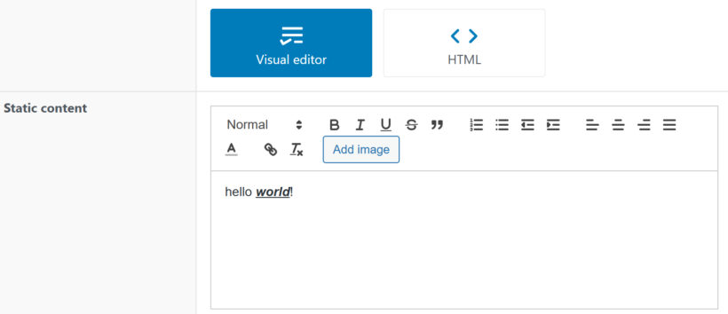
Visual editor
Used to show additional information, instructions, or content within the product form.
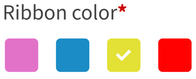
Color swatches
Lets customers pick a color visually using swatches. You can optionally add the name of each color alongside the swatches.
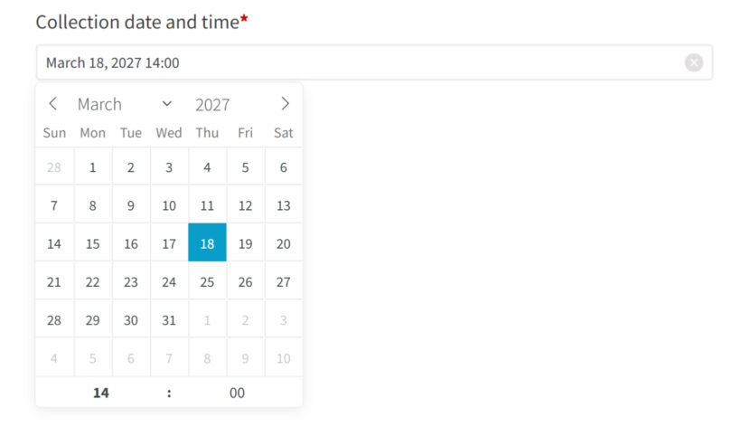
Date
Allows customers to select a date from a calendar. You can also optionally enable a time picker, allowing customers to choose a specific time.
Text labels
Used to display headings or labels to organize and structure your options.
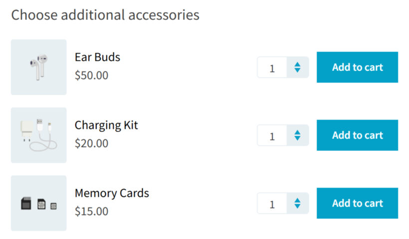
Products
This option allows you to select other products from your store and display them as selectable options. You can choose individual products or entire categories, making it easy to create product bundles or upsells without manually recreating options.
You can display the products using different styles, depending on how you want customers to interact with them:
- Image buttons
- Checkboxes
- Radio buttons
- Dropdown select
- Products (default product-style layout)
Learn more about displaying products as options here.
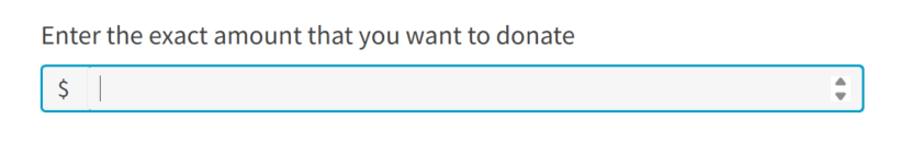
Customer defined price
This field lets customers enter their own price, which will be added to the base product cost. It’s useful for donations, pay-what-you-want pricing, or flexible service fees.
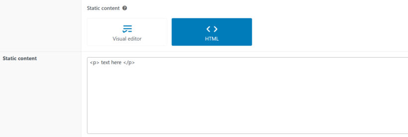
HTML
This option provides a code editor where you can add custom HTML directly into the product form. It’s useful for adding custom layouts, embeds, or advanced formatting.