2. Filter settings
After installing WooCommerce Product Filters, you can configure the plugin settings. These options appear on the plugin settings page at Products → Filters → Settings, and also in the setup wizard. They control how the filters behave on your site.
License key
Enter your license key here. This is essential for the plugin to work.
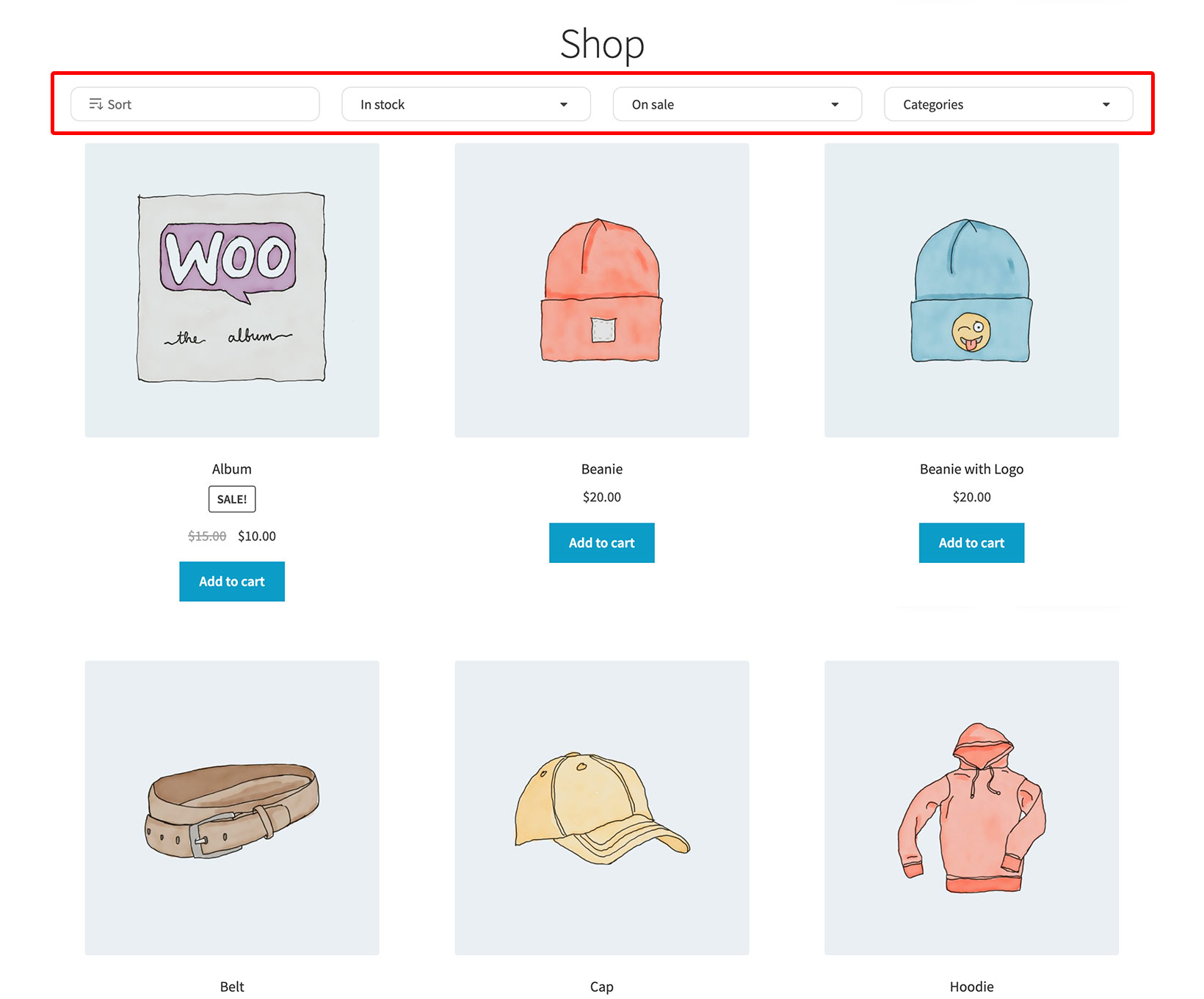
Shop filters
Filter group
This dropdown lists all your filter groups. If you have only just installed the plugin then only the default filter group - "Recommended Filters" - will be available.
The selected filter group will automatically appear on the product list pages which are created by WooCommerce itself, such as the Shop page, categories, product tag archives, etc.
The filters will appear in a horizontal layout above the list of products. If you would prefer to add filters to pages manually, or to display them in a sidebar instead of horizontally, then you can do this. Simply leave this option blank and follow the instructions for adding filters to a page.
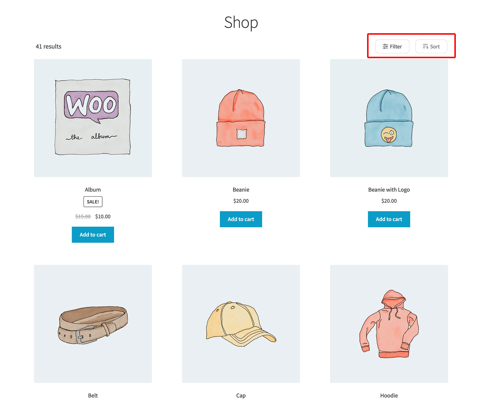
Filter visibility
Use this option to choose whether the filters above the list of products are visible when the page first loads:
- Always display filters (the default) - The filters are always visible above the list of products. When this is enabled, additional options appear allowing you to hide the filters on mobile. This is a popular combination because more space is available on desktop than mobile, so lots of sites like to always show the filters on desktop, while requiring users to click a button to view the filters on mobile. (Learn more about how the filters work on mobile.)
- Click a button to reveal filters - If you want to save space, then you can hide the filters when the page first loads and allow customers to view them in a slide-out panel by clicking a button.
-

- 1. Always display filters above the list of products
-

- 2. Click a button to view filters in a slide-out panel
-

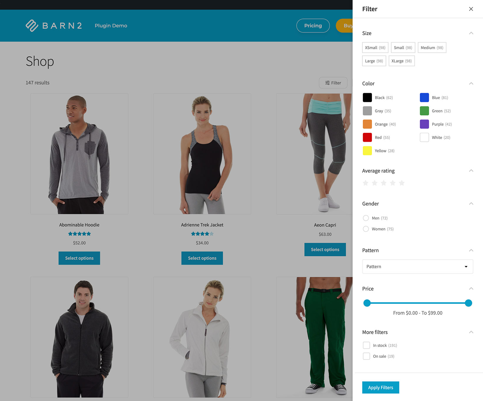
- The hidden filters appear in a slide-out panel
This option only affects the filters above the list of products. It does not change the visibility of filters which you have added to the sidebar (e.g. as widgets).
Number of filters per row
By default, the horizontal filters above the list of products appear as 4 columns of dropdowns. You can change this by entering a different number.
If there are too many columns to fit on a user's screen size, then they will automatically stack onto multiple rows. This prevents them from ever looking broken.
Behavior
Filter mode
There are two options for choosing what happens when customers use the filters:
- Apply filters as soon as the customer makes a selection (the default) - The list of products updates instantly using AJAX as soon as the customer selects an item from any of the filters.
- Click a button to apply the filters - The customer selects from as many filters as they like, and then click an 'Apply Filters' button to update the list of products. If you select this option then a 'Button text' option appears underneath, allowing you to change the text to anything you like.
Tip: In general, it is more user-friendly to use the instant (AJAX) option. This reduces clicks for the customer and updates the list of products instantly. However, if there are lot of filters on the page then it is sometimes better to allow customers to make all their selections before the filters are applied.
Toggle filters
This option is disabled by default and adds open/close arrows to the right of each filter heading in the sidebar widget and slide-out panel. Customers can click on these to open/close the filter options.
Default toggle state
This option appears if 'Toggle filters' is enabled. You can use it to choose whether the filters are closed (the default) when the page first loads, or whether they are loaded open so that the customer can click on a filter heading to close them.

Tip: We would generally recommend setting this option to 'Open' if you have a relatively small number of filters, or 'Closed' if you have lots of filters on the page and want to save space.
Product count
-

- 1. Product count enabled

-

- 2. Product count disabled

Enable this to display the number of products next to each option. For example, if you have 10 'Red' products then the red filter will say '10'. This can be a helpful guide for customers to know which filters to click on without restricting their choices too much.
Infinite scrolling
Enable this option to replace the pagination buttons at the bottom of product listing pages (e.g. the shop and category pages) with infinite scroll.
Notes:
- The WooCommerce Product Filters plugin overrides the pagination in your theme with its own pagination. This means that even if your theme comes with infinite scroll, you will need to enable this option in the WooCommerce Product Filters settings to add infinite scrolling to your site.
- Unfortunately infinite scrolling will not work when using Elementor, the WooCommerce
[products]shortcode, or WooCommerce Product Table.
Out of stock products
This is disabled by default, which means that out of stock products will never appear after performing a filter. When enabled, out of stock products can appear in filter results alongside in-stock products. The "In stock" filter will still hide them when selected.
This setting only affects filter results. To control whether out of stock products appear on the shop page itself, use WooCommerce → Settings → Products → Inventory.
Filter logic
If you have multiple filters on a page (e.g. a size attribute filter and a color attribute filter) then when a customer selects options from both filters, then 'and' logic will be used by default. This means that if a customer selects the 'large' size and the 'red' color then products which are both large AND red will be displayed. You can change this to 'or' logic so that products which are large and/or red will be displayed instead.
Please note that this does not affect the logic within individual filters, for example when the customer selects blue and red from a color attribute filter. This will always use 'or' logic so that products which are blue and/or red will be displayed.
Learn more about the filter logic in WooCommerce Product Filters.
Filter text
You can change the text of the various action buttons and links which appear on the product filters.
- 'Show filters' button - Use this field to change the text which appears in the button which customers click to reveal hidden filters. This button appears above the list of products in 2 scenarios:
- When the 'Visibility' option above is set to 'Click button to reveal filters'.
- On mobiles, if your page contains filter widgets.
- Slide-out panel heading - Use this to customize the heading which appears at the top of the slide-out panel.
- 'Apply filters' button - Customers use this button to finalize their filter selections and load the list of results. This button is used in the following scenarios:
- When the 'Filter mode' option above is set to 'Click a button to apply the filters'.
- In the slide-out panel, regardless of the filter mode. If you have set the filter mode to AJAX and have enabled the slide-out panel on mobile or desktop, then we recommend rewording the button to something more relevant such as "View Products". This is better for this use case because the filters have already been applied in the background, and clicking the button simply closes the slide-out panel.
- 'Clear filters' link - This appears whenever filters have been applied, providing an easy way for the customer to remove all their selections at once and return to the full list of products.
Design
Use the color picker to change the design of the following elements of the filters:
- Primary color - this controls the following elements:
- Primary buttons
- Image filters
- Horizontal filters “active” border
- Active filters list links text and icons
- Scrollbars in each individual filter
- Pricing slider and handles
- Borders of active text input fields
- Borders of active dropdown lists
- Secondary color - this controls the following elements:
- Link borders in active filters list
- Background for scrollbars in each individual filter that requires scrolling
- Checkboxes and radio button borders
- Borders of text inputs when not active
- Dropdown list borders
- Labels filter borders
- Filter title text size and color - this controls the title of each filter
Next steps
Now you have configured the plugin settings, it's time to start adding filters.