How to improve your ecommerce customer journey

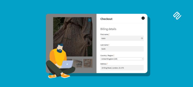
Most stores treat the ecommerce customer journey as a marketing concept. It's really an operational one: every stage either speeds the customer toward purchase or slows them down, and the difference shows up in revenue. I'll walk you through the five stages and the specific places to remove friction at each one.
The default WooCommerce setup gets a store working. However, it doesn't optimize for how customers actually move through it. Out of the box, shop pages bury products behind page templates, filters use clunky dropdowns, every product needs a full page visit before the customer can add to cart, and the checkout sends the customer to a separate page with a long form.
That setup converts pretty well. However, it converts at a far lower rate than a properly tuned setup. That's because each piece of friction shaves off a small percentage of customers, and across five stages those small percentages add up to a meaningful revenue gap.
In this guide, I'll define the five stages of an ecommerce customer journey, walk through what customers expect at each one and cover the specific changes that consistently lift conversion at each stage on a WooCommerce store. I'll point out the plugins that make each change easier as I go.
What is the ecommerce customer journey?
The ecommerce customer journey is the sequence of stages a person moves through, from first hearing about your store to becoming a paying customer. The mainstream model uses five stages, beginning with awareness and progressing through consideration, acquisition, service and loyalty. Each stage is built on the previous one, and a customer who has a bad experience at any stage is likely to drop out before reaching the next.
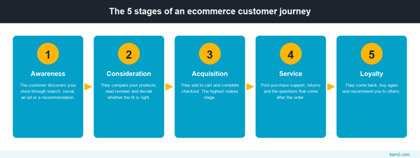
The reason this matters operationally rather than just conceptually is that customers don't drop out at random. Instead, they drop out where the friction is highest. If you can find the highest-friction step in your particular journey and remove it, then conversion at every downstream stage goes up too.
This is also why looking at your store stage-by-stage outperforms looking at overall conversion rate. For example, a store with a 1.5% conversion rate might be doing fine at acquisition but losing customers at consideration because products are hard to find. Another store at the same headline rate might be doing fine at consideration but losing them at checkout. The fix is different in each case.
The 5 stages of an ecommerce customer journey
Before getting into how to improve each stage, it's worth being precise about what each one looks like.
Stage 1: Awareness
A potential customer discovers that your store, product or category exists. The discovery might come from a search engine result, a social media post, a blog mention, a referral from an existing customer or an ad. At this stage, the customer hasn't decided to buy from you. They've decided to take a closer look.
Stage 2: Consideration
The customer is actively evaluating whether to buy. They're comparing products, looking at variations, checking specifications, reading reviews and trying to figure out if your product is the right fit. Most stores lose more potential customers at this stage than at any other, because it's where the largest gap exists between what customers want (easy comparison, fast browsing) and what default ecommerce platforms give them.
Stage 3: Acquisition
The customer has decided to buy. They add the product to cart and move through checkout. This is the highest-stakes stage operationally, because the customer has already done all the work of evaluating and you only have to not get in their way. Friction here costs more than friction anywhere else.
Stage 4: Service
After the order is placed, the customer interacts with you again. They might be tracking the order, asking a setup question, requesting a return or querying the warranty. The service stage shapes whether they buy from you again. A customer who hits a friendly, helpful response after a problem becomes more loyal, not less.
Stage 5: Loyalty
The customer keeps coming back. They buy again, recommend you, talk about you on social media or sign up for a subscription. Loyal customers skip the awareness and consideration stages entirely on repeat purchases, which means each loyal customer is dramatically cheaper to sell to than a new one. Their average order value is also usually higher, because they trust you enough to spend more.
With the stages defined, I'll cover the specific changes that improve each one on a WooCommerce store.
How to improve the awareness stage
The awareness stage is the part of the journey that lives outside your store. The customer hasn't arrived yet, so there are no on-site changes to make in the strict sense. Two underlying levers determine how many people reach you in the first place:
- Organic search. The largest free traffic source for most ecommerce stores. SEO basics still matter (sitemaps, image alt text, page speed, content that targets queries customers are actually typing) and so does technical health. AI search results increasingly summarize your content rather than sending the click, so the bar for being useful enough to be cited has gone up.
- Off-site marketing. The off-site mix covers email, social, paid ads, influencer partnerships and content partnerships. The right combination depends on category. Consumables benefit from email lists, fashion from social and influencers, B2B from content and trade events. The point is to commit to two or three channels and run them properly, not to do all of them.
The mistake stores make at this stage is treating awareness as the same channel mix for every category. Run the mix that matches what your customers actually use, not what's trendy this year.
How to improve the consideration stage
Once a customer lands on your store, the question is how quickly they can find a product they want to buy. The default WooCommerce shop page does the basics, but it has several built-in patterns that slow customers down. Three changes consistently lift consideration-stage conversion on a WooCommerce store.
Make product filters fast and visual
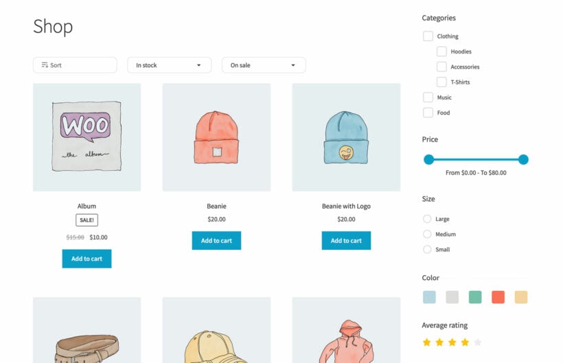
The default WooCommerce filter widgets use dropdowns and text checkboxes. Customers can use them, but they're slow and they require multiple clicks to compare options. AJAX-powered filters that update results without reloading the page convert noticeably better, and visual swatches (color, image) outperform plain text on any product where attributes are visual.
WooCommerce Product Filters handles both. The filters update results live as customers click, support color and image swatches alongside text and dropdowns, and work on any kind of product taxonomy (categories, tags, attributes, custom fields). For more on the considerations around filters specifically, see my guides to WooCommerce filter plugins and speeding up filters without breaking SEO.
Let customers buy without visiting individual product pages
The standard WooCommerce flow forces customers through a product page for every item they want to add to cart. That's appropriate for high-consideration purchases where the customer needs detail before buying, but it's overkill for catalogs where customers already know what they want.
A searchable product table shows products as rows in a table (with name, image, price, variations and an Add to Cart button per row), so customers can buy directly from the listing without leaving it. This is the standard layout for wholesale stores, restaurant ordering, parts catalogs and any category where the customer already knows what they're buying. It's also good for shop pages that complement the regular grid layout: keep the grid for browsing, use a table layout on the wholesale page or the bulk-order page.
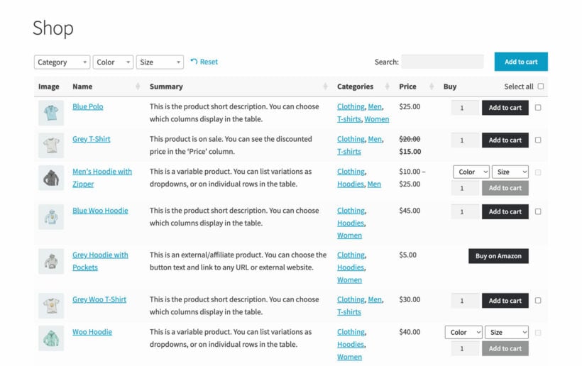
The format gives customers something the standard shop page can't: the ability to scan dozens of products at once, sort and filter inline and add multiple items to cart from a single screen. For categories with large catalogs, the speed difference at the consideration stage is significant.
Don't hide variations behind a single parent product
Variable products in WooCommerce hide every color, size or style behind one product listing. The customer has to click through to see what's actually available. For some categories that's fine. For categories where variations are the product (color-driven fashion, sized homeware, multi-flavor consumables) the standard variable-product display is a consideration-stage drag.
Two patches both work: display variations as individual products on the shop page, or use color/image swatches on the shop tile itself so the customer can see the full range without clicking. See my guide to showing single variations on the shop page for the methods that work in WooCommerce.
How to improve the acquisition stage
Once the customer has decided to buy, every extra step is a chance to lose them. Baymard's research finds the average ecommerce cart abandonment rate is around 70%, with mobile abandonment higher still. A meaningful chunk of that is fixable on the store side.
The default WooCommerce checkout is a long form on a separate page, with optional account-creation prompts and a payment widget bolted to the bottom. It works, but three changes consistently lift completion rates.
Move the cart and checkout into a popup
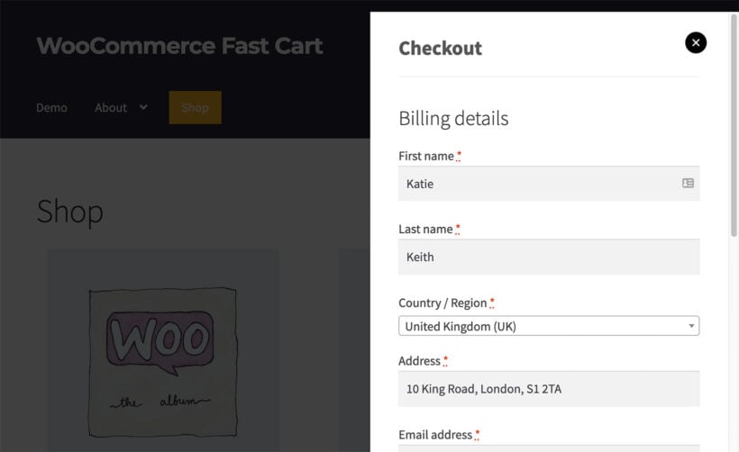
Sending the customer to a separate cart page, then to a separate checkout page, then through a long form is the slowest possible path from Add to Cart to paid order. A popup cart and side-panel checkout keeps the customer in the shopping context, shortens the visual distance to "completed purchase" and lets you put cross-sell content right next to the checkout flow.
WooCommerce Fast Cart opens the cart and checkout as a side panel on whatever page the customer was on. It handles cross-sells in the popup itself, supports multistep flows for stores that genuinely need more fields, and works alongside any payment gateway. For the patterns and trade-offs, see my guides to the WooCommerce mini cart and popup checkout.
Shorten the checkout itself
Baymard finds that around 18% of US online shoppers abandon a checkout because the process is too long or complicated. The average US checkout has nearly 24 form fields by default. A well-designed checkout can do the same job in 12-14.
Audit your checkout against three questions:
- Which fields are genuinely required for fulfillment, and which exist because they came with the template?
- Are you forcing account creation before purchase, or is guest checkout the default?
- Are payment options the customer expects (Apple Pay, Google Pay, PayPal, local methods for international audiences) actually present?
For the broader playbook, see my guide to optimizing the WooCommerce checkout page and the companion piece on speeding up the checkout.
Match payment options to your audience
A customer who can't pay the way they expect won't fight to find an alternative. They'll abandon. Apple Pay and Google Pay convert significantly better on mobile than card forms, regional methods (iDEAL, Klarna, AfterPay) matter for the audiences that use them and B2B audiences often want invoice or bank-transfer options.
Adding payment methods isn't free (each one adds setup and reconciliation overhead), so prioritize by audience rather than turning everything on. For an audience that buys on impulse from mobile, Apple Pay matters more than B2B invoicing. For a wholesale catalog, it's the reverse.
How to improve the service stage
The service stage starts the moment the order is paid. Most stores treat it as a cost center, but it's the cheapest stage of the journey to make customers loyal, because the customer's expectation is low and the upside of exceeding it is high.
Three things consistently turn service into a loyalty driver:
- Proactive order updates. A confirmation email, a shipping email, a delivery notification. None of these is expensive to send and the absence of any of them creates anxiety customers blame on the store rather than the courier.
- A useful My Account area. The page should cover order history, easy reorders, downloadable invoices and returns initiation. Customers who can self-serve don't have to email you, which saves them time and saves you support cost.
- A clear returns and warranty process. Hide the returns page and customers assume it's hostile. Make it easy to find and the customer who reads it before buying converts at a higher rate, not a lower one.
Customer service software (Help Scout, Zendesk, the WooCommerce-native support plugins) helps once you're at scale. However, small stores can run this stage well with email and a clear set of templates. the trick here is to notice when you've scaled enough to need a proper help desk. This typically happens the moment you hire support staff.
How to improve the loyalty stage
The loyalty stage is where the unit economics of an ecommerce store quietly win or lose. A customer who comes back two or three times is dramatically more profitable than a single-purchase customer, because the acquisition cost is spread across multiple orders.
A few things consistently produce more loyalty:
- Email lists you actually use. The store with the active email list outsells the one with the bigger Instagram following on most categories. Build the list at checkout (with consent), and send proper emails, not just "10% off everything" blasts.
- Wishlists and saved-for-later carts. A customer who can't buy now will often return later if their cart is preserved. Saving the cart for them makes that return frictionless.
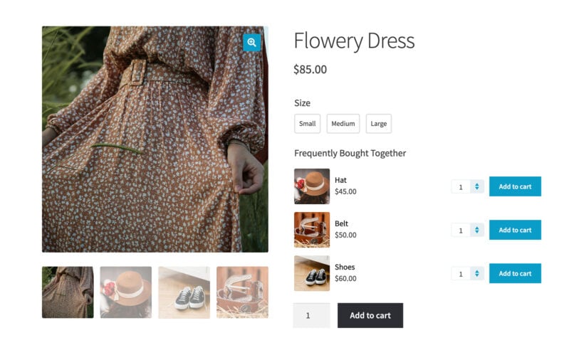
- Customer-aware recommendations. A returning customer doesn't need to be shown the same homepage twice. Recommendations based on what they've already bought or browsed lift repeat orders meaningfully. For the patterns that work, see my guides to frequently bought together and product add-ons.
- A reason to come back. Possible levers include subscription options on consumables, restock alerts, loyalty perks and seasonal launches. The mechanism matters less than having one.
For more on the metrics that tell you whether the loyalty stage is working, see my guide to WooCommerce analytics. Repeat-purchase rate and customer lifetime value are the two numbers worth watching most closely at this stage.
Final thoughts: Customer journey work compounds
The five stages of an ecommerce customer journey aren't a checklist to run once. They're a permanent set of dials, each tunable independently, that collectively determine how well your store converts.
Remember: A 5% lift at the consideration stage and a 5% lift at the acquisition stage together produce a far bigger revenue impact than either change in isolation, because each improvement carries customers through to the next stage in larger numbers.
The fastest place to start, in most stores, is the consideration-to-acquisition handoff. Make products easier to find, give customers a way to buy without visiting every product page and shorten the checkout. Those three changes, in that order, move the largest share of conversion in my experience.
For more on each piece of the stack, see my deep dives on checkout customization, product filter plugins and WooCommerce UX.