6 tips for designing high-converting web forms

Forms constitute an integral part of the web. Businesses use forms for generating leads, taking payments, and capturing important data. Forms are a critical interface between you and your customers.
Sadly, good form design is often neglected. The truth is that you need well-optimized forms to entice users to give you information. Revamping your web forms with a focus on UX and accessibility could increase your conversion rates, leading to a boost in revenue.
Why does form design matter?
The design of your forms impacts your website from both a UX (user experience) and an accessibility standpoint. Badly designed forms lead to unhappy customers, and therefore, fewer conversions.
Having well-designed, accessible forms tells users that your brand is professional, thoughtful and easy to work with.
When Expedia realized that many users who clicked the 'Buy Now' button on their website did not complete their transaction, they started looking for answers.
It turns out that they had an extraneous “Company” field on their checkout form that was confusing customers. After removing the field, sales surged overnight. Bad form design was costing Expedia $12m per year!
That’s a powerful real-world example that should illustrate the importance of good form design for any company, large or small.
Here are 6 tips for designing high-converting web forms.
1. Tighten up your structure
When creating a new form, the first thing to keep in mind is the structure of the form itself.
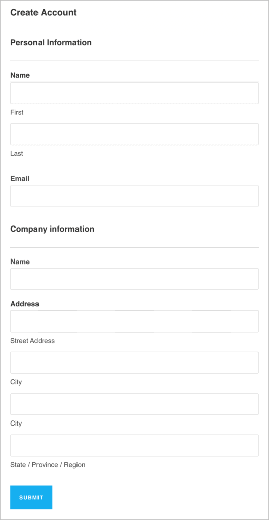
For example, the fields in your form should be ordered logically, with related information grouped together. When related fields are grouped together in “blocks” or sets, there is a better flow from one question to the next. This creates a better experience for the user, who can more easily make sense of the required information.
To achieve a better form structure, add headings to each section that tell the user what kind of information they will be required to fill out. For example, “Personal information” and “Company information”.
Additionally, ensure your forms use a single-column layout, as this makes them more scannable, with a clear path to completion.
2. Less is more
The golden rule of form design is “less is more”. In other words, don’t include any fields that aren’t absolutely necessary. The less work for the user filling out the form, the better, as this will result is a higher completion rate and therefore more leads for your business.
Also, unless absolutely necessary, don’t ask users for their phone number. Asking for an email address is one thing, but a phone number can set off alarm bells in a user’s mind (“why do they need my number?”; “What are they going to do with it?”). In fact, according to ClickTale, asking for a phone number can decrease sign-ups by up to 39%!
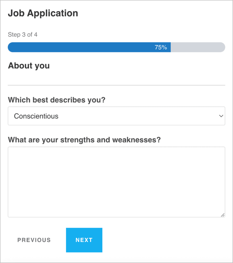
Finally, if you’ve pruned your form as much as humanly possible and it’s still looking rather long, consider splitting it up into multiple steps. This leads to a better experience by making things more manageable for the user. It’s also a good idea to add a progress bar to long forms so users can see how much they have left to complete.
3. Easy fields first
A simple but often overlooked tip for designing high-converting forms is to put all the easy fields first.
Start your form with fields that are easy to fill out (like Name and Email) and put the more time-consuming fields at the end (stuff like billing or account information).
If the first few fields feel like a hassle, the user is more likely to give up before clicking “Submit”. However, if the user feels like things are moving quickly in the beginning, they’re less likely to leave the page since they’ve already committed to filling out the form.
4. Typography matters!
Another thing to keep in mind when designing web forms is typography. Forms with labels and descriptions that are difficult to read will turn users away and reduce completion rates.
Start by choosing a font that’s easy on the eyes, and increase the size so users don’t have to squint to read it. Keep your label text short and to the point (1-5 words ideally). If fields require longer explanations, include a description but try to keep it brief.
Additionally, avoid all caps and consider using sentence case for labels as opposed to title case. Sentence case is easier to read, especially for longer labels. Here’s an example:
This Is a Sentence Written in Title Case
This is a sentence written in sentence case
Can you see why sentence case is easier for the eye to scan?
5. Mobile-friendly design
Mobile phones now account for more than half of the world’s internet traffic! You’re almost certainly going to get users filling out your forms from their mobile devices, which means mobile-friendly form design is more important than ever.
When filling out a form from a mobile phone, you have to tap a small screen as opposed to a keyboard. This increases the chances of users making mistakes or pressing the wrong buttons.
To ensure a smooth mobile experience, create a single-column form and ensure the “Submit” button stands out and is large enough on the screen. You should also enable autocomplete where possible; this will speed up the form filling process for users who type slowly on a mobile device.
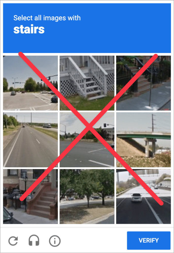
6. Avoid CAPTCHAs
If there’s one thing that most website owners have struggled with, it’s form spam. Unfortunately, the web is filled with spam bots that trawl websites looking for forms to submit. This leads to web designers implementing anti-spam measure such as CAPTCHAs.
A CAPTCHA reduces spam by asking users to complete a test to prove they aren’t a bot. This usually involves choosing certain images from a selection or typing specific numbers and letters into a box. While CAPTCHAs can help prevent spam, they are also tedious, time-consuming and bad for accessibility.
In other words, CAPTCHAs make for a terrible user-experience, so you should avoid them at all costs! Rather, utilize a less intrusive anti-spam measure such as a honeypot field, or a third-party plugin that runs in the background without affecting your forms.
Form design for WordPress websites
If you run a WordPress site, you can save yourself a lot of time by choosing the right form plugin. Most popular form plugins for WordPress are built with UX and accessibility in mind. A good example is Gravity Forms, which has been a mainstay in the WordPress ecosystem for over a decade.
Not only does Gravity Forms include a range of accessibility features, it also boasts a vast library of powerful extensions and add-ons, making it a top choice for designing high-converting web forms.
Create high-converting web forms
There are still loads of websites out there with long, badly structured forms that are tedious to fill in. By embracing form design best practices, you can help create a more pleasant user experience and a more accessible web.
While there are many other things to keep in mind when designing web forms, by implementing these 6 tips, you should be well on your way to improving your website’s UX and increasing conversions.