Ecommerce best practices: 10 changes that actually lift revenue


Most "ecommerce best practice" lists are interchangeable lists of buzzwords. The ten below are different: they're the changes that consistently move revenue on WooCommerce stores I've worked with, ordered by the size of the impact and the speed at which you can ship each one.
The default WooCommerce setup gets a store live. However, this doesn't make a store good. Common weak points include the default checkout, the default shop page, the default product templates and the default settings, all of which leave significant revenue on the table at every stage of the customer journey.
You don't need to fix all ten of the practices below at once. Pick the two or three where your store currently performs worst, ship those, then come back for the next round. The compounding effect of running through this list over a longer period will make more and more difference to your sales over time.
In this guide, I'll walk through the ten ecommerce best practices that consistently earn their place, the rough impact each one has on a typical WooCommerce store, and the specific plugins and patterns that make each one easier to ship.
Let's do it!
1. Streamline the checkout flow
This is the single highest-leverage change that most stores can make. Baymard's research puts the average cart abandonment rate at around 70%, and about 18% of those abandonments are caused by a checkout that's too long or complicated. Fix the checkout and you recover lost revenue without spending more on traffic.
Three changes consistently lift checkout completion:
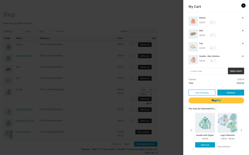
- Move the cart and checkout into a popup. The default flow sends the customer to a separate cart page, then a separate checkout page. A popup cart and side-panel checkout keeps the customer in the shopping context the entire way to a paid order. WooCommerce Fast Cart handles this with a side panel that opens on Add to Cart and carries the customer through checkout without ever leaving the page.
- Cut the form down. The default checkout has roughly 23 fields. A well-designed one does the same job in 12-14. Audit each field and remove anything not required for fulfillment. YITH's Checkout Manager plugin makes this easy and is compatible with WooCommerce Fast Cart.
- Default to guest checkout. Forcing account creation before purchase is one of the most common abandonment causes. Offer the account creation as an opt-in after the payment, not as a gate before it.
For the broader playbook, see my guides to customizing the WooCommerce checkout, speeding it up and breaking longer checkouts into steps.
2. Invest in product imagery and video
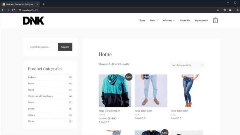
Around three-quarters of online shoppers say product images are the most influential element on a product page. Photos are how customers compensate for not being able to touch or try the product, and an under-shot product page is one of the cheapest places a store can lose conversion.
What "good" looks like in practice:
- Multiple high-resolution shots per product. Front, back, in-use and detail shots, all at the same orientation so they read as a set.
- A video where the format makes sense. A 15-30 second clip of the product in use is one of the cheapest conversion lifts available for apparel, gadgets, food and gifting categories.
- Variation-specific imagery. If you sell a t-shirt in five colors, each color should show the actual color, not a single shot with a swatch picker.
- Lifestyle and context shots. A product on a clean background is the baseline. Add at least one shot of the product being used by a person in its real context.
For the variation-imagery side specifically, see our guide to WooCommerce product variations.
3. Get product discovery right
Customers who can't find a product won't buy it. The default WooCommerce shop page uses dropdown filters and forces every product through an individual product page before customers can add to cart. Both patterns are friction.
Two changes consistently lift consideration-stage conversion:
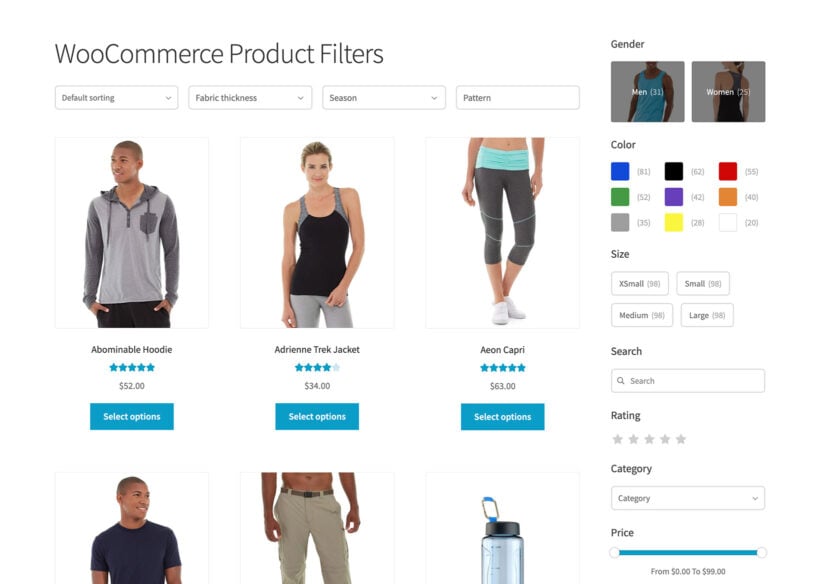
- Fast, visual filters in the sidebar. AJAX filters that update results live, with color and image swatches alongside text and dropdowns, dramatically outperform the default. WooCommerce Product Filters handles this on the shop page and category pages.
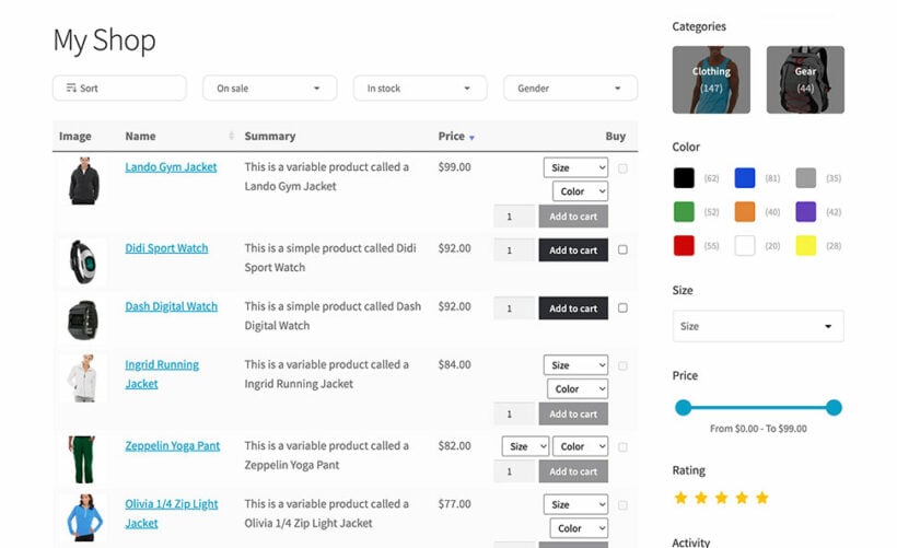
- A product table for catalog-style browsing. Categories with large catalogs (parts, restaurant menus, wholesale lists, bulk-order pages) work much better as a sortable table with inline Add to Cart than as a grid that forces every customer through an individual product page. WooCommerce Product Table handles this pattern and pairs well with the regular shop page for stores that need both layouts.
For deeper coverage, see our guides to WooCommerce filter plugins and the wider WooCommerce UX playbook.
4. Show real social proof at the right moments
Social proof works when it's specific and timely. "Trusted by thousands" is generic and converts no one. "Bought by 42 people in the last 24 hours" is specific and converts much better.
Useful patterns:
- Customer reviews and star ratings. The single most universal form of social proof. See practice 8 for the specifics.
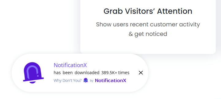
- Recent-purchase activity. "X people bought this today" works when it's accurate. You can do this with the NotificationX plugin, which we use on this site.
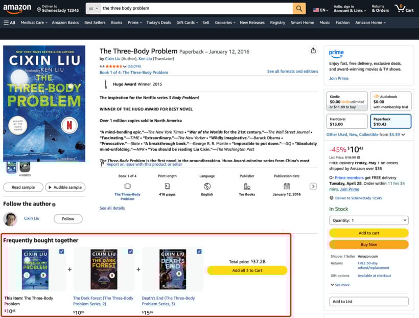
- Frequently bought together. The Amazon pattern: showing the products other customers paired with this one. See my frequently bought together guide for the WooCommerce implementations.
- User-generated content. Customer photos on the product page (via Instagram tags, dedicated submission flows or review attachments) reassure buyers that the product looks the way the photos suggest.
Avoid fabricated social proof. For example, a "5 people are viewing this product" widget that's actually a random number generator is worse than no widget at all, because customers eventually notice.
5. Build a smart product recommendation strategy
McKinsey's research finds that 35% of what consumers buy on Amazon comes from product recommendations. You don't need Amazon's data science to capture some of that lift. Three placements cover most of the value on a WooCommerce store:
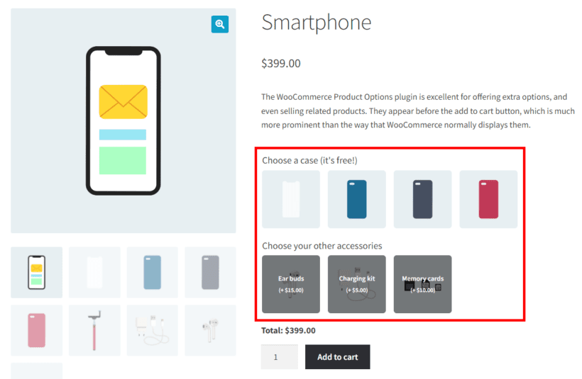
- On the product page, above Add to Cart. "Complete the look" or "Customers also bought" widgets right above the buying button capture attention at the highest-intent moment. WooCommerce Product Options has a Products option type that displays related products in this slot directly on the product page.
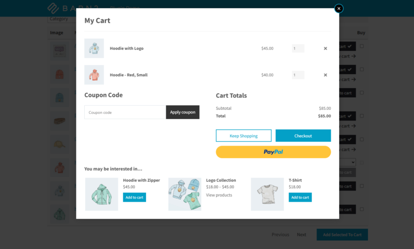
- In the cart at the Add to Cart moment. The customer is most receptive to a complementary product in the second after they've added something. Fast Cart's popup includes a cross-sells slot for exactly this moment.
- Post-purchase, on the thank-you page. The buying decision is already made, so a "while you wait, you might also like" block on the order confirmation page converts higher than any mid-funnel placement. See my upselling guide for the mechanics.
Pair recommendations with the underlying cross-sell relationships in WooCommerce. See my cross-selling examples for the patterns that work in different categories.
6. Run email, social and content marketing properly
The temptation when traffic is the bottleneck is to throw money at ads. The cheaper play is the channels you already own.
- Email list. Build it at checkout (with consent), at signup and through content opt-ins. Send proper emails covering new arrivals, customer stories or restock alerts at a sustainable cadence, not just "10% off" blasts.
- Social media. Pick one or two platforms where your audience actually spends time and commit. Three platforms run badly outperforms five run halfheartedly only when "outperforms" is rounded down to zero.
- Content marketing. Write about the problem your product solves, not the product itself. Customers searching for the problem land on the post and discover the product. See my guide to coming up with new product ideas for one angle on how content and product development feed into each other.
- Niche influencers and partnerships. A creator with 5,000 engaged followers in your exact niche will usually convert better than a generalist with 500,000 followers across all categories.
The discipline that matters most across all four channels: consistency over intensity. A weekly newsletter sent for a year beats a dramatic launch campaign that runs once.
7. Track the right metrics
Every store benefits from tracking the same handful of metrics. Most stores end up tracking either far too many or only the headline number, neither of which produces better decisions.
The five to start with:
- Conversion rate. Visitors who buy as a percentage of visitors who arrived. The most direct measure of how well the store is doing its job.
- Average order value. Revenue per order. The lever you grow when traffic is hard to grow.
- Cart abandonment rate. The percentage of carts started that don't finish. Direct check on whether the checkout is working.
- Customer retention rate. The share of last year's customers who came back. Existing customers are dramatically cheaper to sell to than new ones.
- Cost per acquisition. What you pay per new customer across all paid channels. Tells you whether growth spending is sustainable.
For the underlying analytics setup that produces these numbers reliably, see my guide to WooCommerce analytics.
8. Make customer reviews part of the product page
Customer reviews are the most-trusted form of social proof, because they come from people with no commercial interest in the sale. The standard pattern is a star rating in the product summary block plus a list of written reviews further down the page.
What to optimize:
- Ask for the review at the right moment. Send the request 7-14 days after delivery, not on the day the order ships. The customer needs time to actually use the product.
- Make leaving a review easy. A one-click star rating link in the email that pre-fills the form converts dramatically better than "please go to our site and leave a review".
- Show recent reviews prominently. A review from last week is more reassuring than one from 2022, even if the older one is more positive.
- Encourage photos with reviews. Customer photos do double duty as social proof and as supplementary product imagery.
WooCommerce ships with basic reviews built in. For richer review displays (badges, photo reviews, importing reviews from Google or Facebook), plugins like Yotpo or Loox extend the default with the features most stores eventually need.
9. Publish a clear returns policy
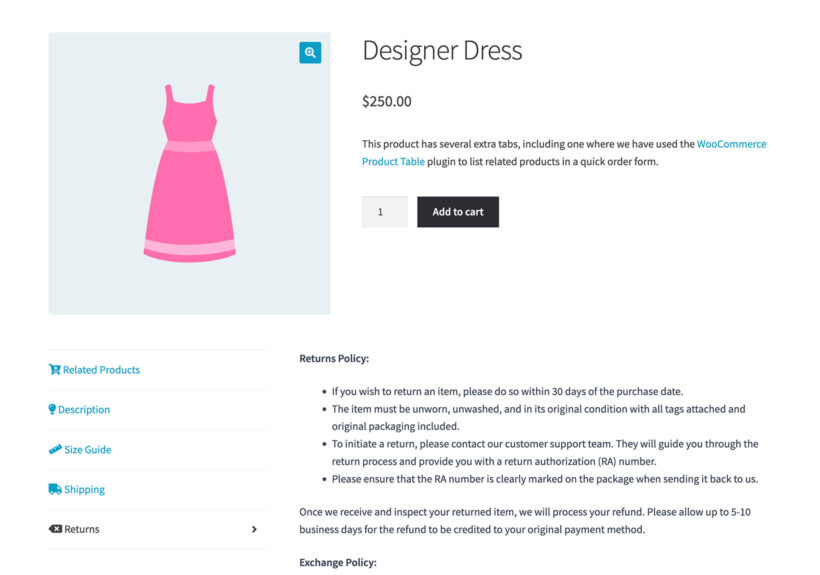
A clear returns policy increases conversion, not decreases it. Customers are reassured by seeing the policy before they buy, and the small percentage who actually return products are usually buying again soon afterwards.
A good policy covers:
- The conditions under which returns are accepted (unopened, within X days, original packaging).
- The return window. 30 days is standard, longer windows reduce returns paradoxically because customers feel less rushed.
- The return process. How the customer initiates a return, where they ship to, how the refund is issued.
- Any product categories excluded from returns (personalized, perishable, intimate apparel).
- Customer service contact for questions about the policy.
Customers who can't find or understand your returns policy bounce. Put the policy on its own page, linked from the footer and the checkout page, and write it in plain English. Or even better, use the WooCommerce Product Tabs plugin to add a returns tab directly to the product page
10. Offer the payment methods your audience expects
A customer who can't pay the way they expect won't search for an alternative. Instead, they abandon their cart.
Most WooCommerce stores need this base set of payment options:
- Major credit and debit cards via Stripe, Square or similar.
- PayPal. Some audiences strongly prefer it, and the convert-on-saved-card lift is real.
- Apple Pay and Google Pay on mobile. The single highest-impact additions on mobile-heavy stores.
- Buy-now-pay-later options (Klarna, Afterpay, Affirm) for higher-ticket products.
Final thoughts: best practices compound
None of the ten practices above will transform a store on its own. The leverage comes from running through the full list and shipping the changes systematically. For example, you might achieve a 5% lift at checkout, a 5% lift from better recommendations, a 5% lift from better filters and a 5% lift from clearer returns policy. Each look small in isolation, but together they're the difference between a store that grows and one that stagnates.
The fastest place for most stores to start is the checkout itself. That's because every other practice eventually flows back through the same conversion bottleneck. A streamlined checkout paired with a popup cart and a cross-sell slot is the smallest set of changes that moves revenue measurably in most stores. From there, layer in product imagery, filters, recommendations and the rest as your category allows.
For more on the underlying ecommerce mechanics, see my guides to average order value and new product ideas.