5 checkout page examples (and how to copy them in WooCommerce)

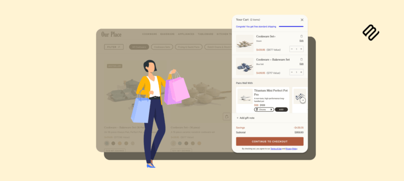
The best ecommerce checkouts share five design choices. I'll show you each one in action on a real retail site (Nike, Our Place, Beauty Bay, ASOS, and Sony), explain why it works, and walk through how to apply the same approach to your WooCommerce store.
A checkout page either gets the customer to "order placed" with minimum friction, or it loses the sale. Baymard's research puts the average cart abandonment rate at over 70%. But the good news is that a meaningful share of that is fixable.
In this guide, I'm going to share five real-life examples of high-converting checkouts that you can copy in your WooCommerce store. I'll walk you through each example, identify what specifically each retailer is doing right, and show you how to apply the same in WooCommerce. Most of these recommendations can be implemented using WooCommerce Fast Cart, which you can set up in minutes.
What makes a good checkout page
Before getting into the examples, it's worth being clear about what the checkout page is actually optimizing for. The job is to take a customer who has already decided to buy and remove every obstacle between them and a completed order.
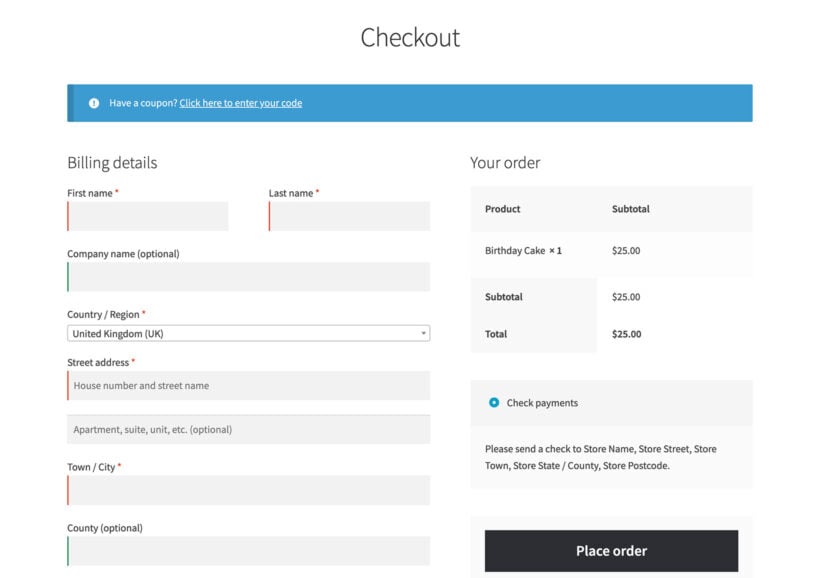
The default WooCommerce checkout above is functional but not optimized. Every billing field, every shipping field, every payment input and the order summary all live on the same long form. That's fine for a customer who knows exactly what they want and isn't easily distracted. For everyone else, the form length, the visible header and footer, and the lack of progress indicators all cost conversions.
The five examples below show what the same job looks like done well.
Example 1: Nike's distraction-free checkout
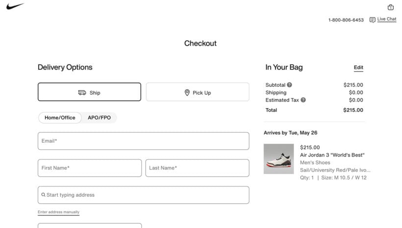
Nike strips every non-checkout element from the page the moment a customer clicks Checkout. The header disappears, the navigation disappears, the footer disappears. What's left is the order summary on the right, the billing and shipping fields in the middle, and a clear payment-and-place-order flow at the bottom.
The pattern works because it removes the temptation to click away. A customer in the middle of entering their card details who sees a "Sale: 50% off everything" banner in the header has a perfectly reasonable reason to bounce. Nike removes that off-ramp.
Nike also keeps the order summary pinned on the right at every step. The customer can see what they're paying for and what the running total is without scrolling. Order summary visibility is one of the easiest trust signals to add and reliably reduces last-minute abandonment.
They have also made several other small choices that add up to make a big difference. This includes:
- Large form fields and buttons that work on mobile.
- A single visible support link in the top corner for anyone who gets stuck.
- A color palette that holds the customer's eye on the action.
In WooCommerce, you can match Nike's approach with a popup or side-panel checkout that hides the theme's header and footer for the duration of the flow. WooCommerce Fast Cart handles this by opening checkout as a side panel over the current page, with no theme chrome visible.
Example 2: Our Place's express checkout options upfront
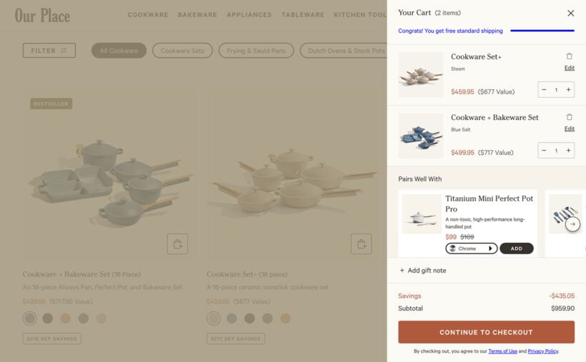
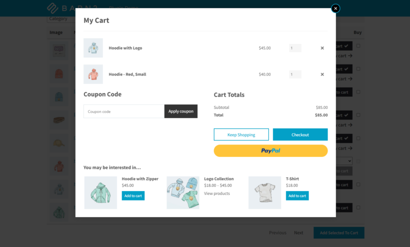
When you add a product from Our Place to your cart, you are immediately presented with an "Express Cart" popup. This beautifully designed mini cart contains everything you need to quickly review and edit your order. It includes a free shipping calculator encouraging you to buy more and smart related products. There's even a field to add a gift note before proceeding to the checkout. (Checkout then takes place on a separate page.)
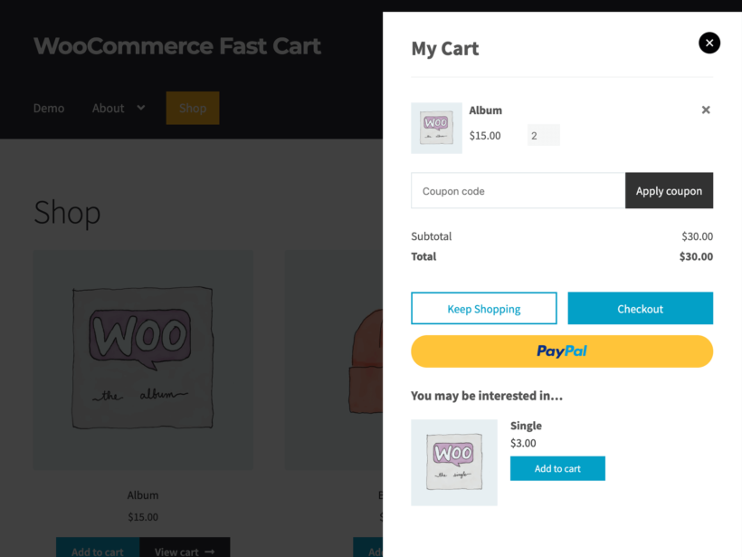
In WooCommerce, you can easily achieve this or better with the WooCommerce Fast Cart plugin. This provides a side cart remarkably similar to Our Place. It takes this a step further by also allowing you to complete the entire checkout and payment within the side cart. This removes a step from the purchase process, making shopping even quicker than it is with Our Place.
Example 3: Beauty Bay's multi-step checkout with address autofill
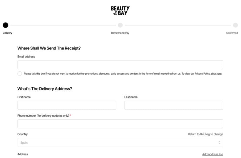
Beauty Bay breaks the checkout into a clear three-step flow: contact details, then shipping address, then payment. Each step shows only what's needed for that step, plus a progress indicator at the top showing where the customer is in the sequence.
Multi-step checkouts beat single-page checkouts in two specific situations: when your form is genuinely long (B2B accounts, complex shipping, gift options) and when the visual mass of a single-page form is what's intimidating customers. For shorter forms, single-page is faster. Multi-step is the right call when the alternative is a scrolling form that looks endless.
Beauty Bay also uses address autofill. Typing the first few characters of an address pulls suggestions from a postcode lookup. Selecting one fills in street, town, and postcode automatically. The time saved per checkout is small (10-15 seconds) but the friction reduction is significant. Customers experience it as "the form just knew where I live" rather than "I had to type my address again".
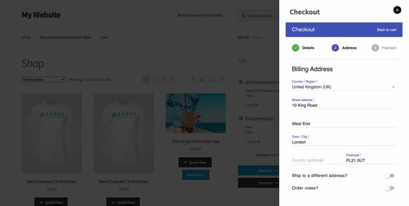
In WooCommerce, you can add multi-step layouts by combining the Fast Cart side-panel checkout with a multi-step plugin like CheckoutWP. This will display the multi-steps within the popup checkout. Fast Cart supports Google auto-address lookup to save customers time in entering their address.
Example 4: ASOS's strategic checkout upsells
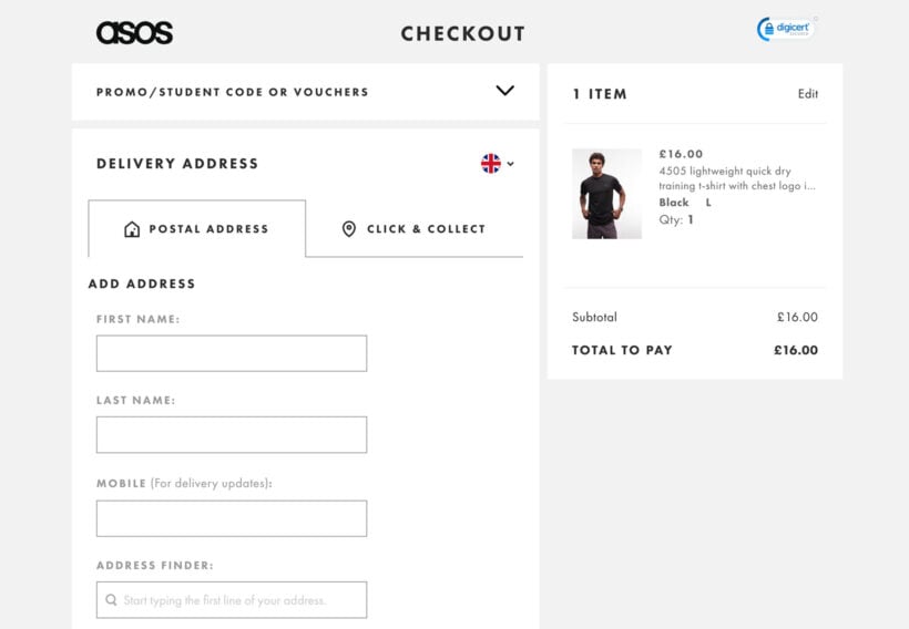
The customer who's already at the checkout has made the buying decision. ASOS uses that moment to surface one strategic upsell: their premium delivery membership, which gives unlimited next-day shipping for a flat annual fee. The customer can opt in with a single click or ignore it and proceed.
The trick with checkout upsells is restraint. One well-chosen upsell or cross-sell at the right moment converts; three competing pop-ups stacked on top of each other distract from the order. ASOS picks a single high-margin add-on that genuinely benefits the customer (faster shipping is a real value to a buyer who's about to spend money).
The most useful checkout upsells share two characteristics:
- Low cognitive load. The customer can evaluate the offer in a glance: a delivery upgrade, a small accessory or a service add-on. Anything that requires reading and comparing belongs earlier in the journey.
- Single click to accept. The upsell shouldn't take the customer out of the checkout. If clicking accept means navigating back to the product page, the friction kills the conversion you just earned.
In WooCommerce, checkout cross-sells can run in the popup cart (Fast Cart shows them automatically) or as order bumps on the checkout page itself. See my guides to frequently bought together and upselling for the techniques and plugin recommendations.
Example 5: Sony's trust signals and payment clarity
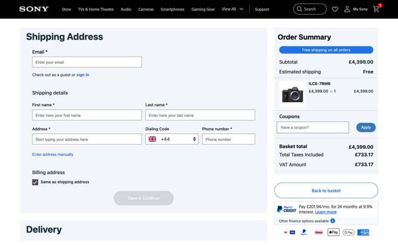
Sony shows all the payment methods it accepts as icons in the right column from the moment the customer lands on the checkout. Visa, Mastercard, PayPal, Klarna, and Apple Pay are all visible before the customer reaches the payment step. To decide which of these to offer, it helps to weigh up the best WooCommerce payment gateways side by side. The signal is "you'll be able to pay the way you want", which removes a quiet source of late-stage abandonment.
Beyond the payment-method row, Sony's checkout sits on a foundation of less-visible trust signals: a secure-checkout padlock and SSL indicator, a clear order summary with itemized costs (no surprise fees revealed at the last step), an estimated delivery date, and a customer support link in the header.
The shipping cost transparency is particularly important. Sony updates the estimated shipping line from "TBD" to an actual cost as soon as the customer picks a shipping method, rather than holding the number back until the payment step. Unexpected costs at checkout are Baymard's most-cited reason for abandonment; showing the number early eliminates that surprise.
In WooCommerce, payment-method icons are usually rendered by the payment gateway plugins themselves or by a small footer widget. SSL indicators come automatically with HTTPS. The bigger trust-signal lift comes from displaying shipping and tax estimates early. Most WC checkouts show shipping only after the address is entered, which is too late. Configure your shipping methods to display rates before address submission where possible.
How to apply these ideas on your WooCommerce store
You don't need five separate plugins to get a checkout that uses all five ideas. As we have seen, WooCommerce Fast Cart handles the distraction-free side-panel, the multi-step flow, the cart-level cross-sells, and the integration with whatever payment gateway you've configured. Combined with a properly set up Stripe or PayPal configuration for express wallet payments, the approaches from all five examples above are reachable from a single plugin install.
The implementation sequence I'd recommend:
- Audit your current checkout. Walk through it as a customer on desktop and mobile. Count the form fields, time the flow, and note every place you have to scroll or wait.
- Install Fast Cart and replace the default cart/checkout flow. Most stores get the biggest single conversion lift from this change alone.
- Add the express-payment options your audience uses. Apple Pay and Google Pay for mobile-heavy stores; PayPal for legacy customer bases; regional methods (iDEAL, Klarna, AfterPay) where the audience warrants.
- Add one strategic checkout cross-sell. Pick the highest-margin or highest-attach-rate complement and put it in the cart popup. Don't add five.
- Surface trust signals. Display payment-method icons, secure-checkout indicators, an early estimated shipping line, and a visible returns policy link in the footer.
Final thoughts: copy the approach, not the brands
The five checkouts above are by very different stores selling very different products at very different price points. What they share is a disciplined approach to the same five design problems: removing distraction, offering a fast wallet path, structuring the form well, picking one strategic upsell, and showing the customer enough information to trust the order.
Your store doesn't need Nike's design budget or ASOS's traffic to apply these ideas. Each one is implementable in a small WooCommerce store with the right plugins and a few hours of configuration. The compounding effect of running through all five is the difference between a checkout that loses two thirds of carts and one that holds onto a meaningful share more.
For more on the broader checkout playbook, see my guides to customizing the WooCommerce checkout page, speeding up the checkout, creating a Shopify checkout in WooCommerce, and the wider ecommerce customer journey the checkout sits inside.