How to improve your checkout conversion rate
Checkout conversion rate is the cleanest indicator of whether your checkout is working. It tells you what percentage of customers who reach the checkout actually finish the order, and unlike top-of-funnel metrics, the changes that move it are mostly things you can fix this week.
A store with 1,000 monthly visitors and a 3% checkout conversion rate makes 30 orders. The same store with the same traffic and a 5% rate makes 50 orders without any extra ad spend, new products or bigger email list. The only difference is fewer customers dropping off at the final step.
I'll cover what checkout conversion rate is, how to calculate it and what counts as a good number to aim for. Then I'll walk through six checkout-side changes that consistently lift it, and finish with how WooCommerce Fast Cart shortens the purchase journey itself so all those changes pay off faster.
What is checkout conversion rate?
Checkout conversion rate is the percentage of customers who reach the checkout page and successfully complete the purchase. It's a narrower metric than the store's overall conversion rate, which includes everyone who lands on any page on the site.
The reason it deserves its own metric is that the customer at checkout has already done all the hard work of finding a product, deciding to buy and adding it to cart. If they drop out at this stage, it's almost always something the store can fix. Form length, payment options, shipping costs and trust signals are all on the store side, not on the customer's intent.
Checkout conversion rate is the inverse of cart abandonment rate. If 70% of shoppers who reach your checkout abandon, your checkout conversion rate is 30%. The two numbers describe the same thing from opposite directions.
How to calculate your checkout conversion rate
The formula is straightforward:
Checkout conversion rate = (completed orders / checkouts started) × 100%
Here's a worked example: Say 500 customers reached your checkout page last month, and 200 of them paid. Your checkout conversion rate is (200 / 500) × 100% = 40%. The other 300 (60%) abandoned somewhere between landing on the checkout and clicking the place-order button.
In WooCommerce, those two numbers come from different places:
- Completed orders. Pull this from Analytics → Orders in your WordPress dashboard. It's the easy half of the formula.
- Checkouts started. This one needs Google Analytics (or a similar tool) with a funnel event that fires when a visitor lands on the checkout URL. WooCommerce on its own doesn't count "checkouts started", only "orders placed".
For a fuller analytics setup that makes the underlying conversion data measurable, see my guide to WooCommerce analytics.
What's a good checkout conversion rate?
The honest answer is that it depends on your category and traffic mix. As a rough guide, though, here's what to expect at each level:
- Below 30%: Something is materially wrong with the checkout. Likely culprits include form length, surprise costs, missing payment methods or a broken step in the flow.
- 30-45%: Typical range for stores running the default WooCommerce checkout with a few tweaks.
- 45-60%: Well-optimized checkouts with express payment options, short forms and clear costs.
- 60%+: Top tier. Usually means a popup checkout with strong wallet integration on a mobile-heavy audience.
Baymard tracks the average ecommerce cart abandonment rate at around 70%, which implies an industry-average checkout conversion rate near 30%. Stores that invest in checkout optimization land well above that benchmark.
How to improve your checkout conversion rate
Six changes consistently lift the number on WooCommerce stores I've worked with. None of them require redesigning the rest of the shop, and most of them are configuration changes you can make this afternoon.
Cut the form to the essentials
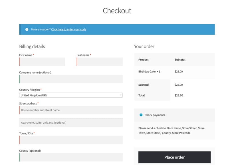
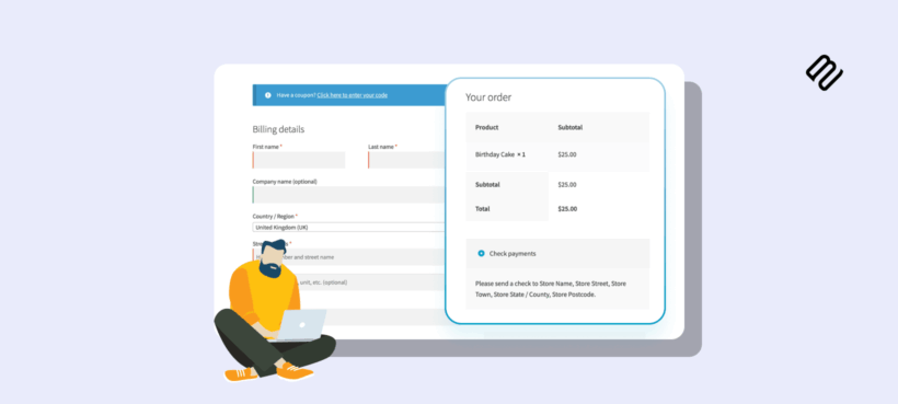
The default WooCommerce checkout above asks for around 23 fields by default. A well-designed checkout does the same job in 12-14. Every additional field is a small percentage of customers who decide it's not worth the effort.
Baymard's research finds 17% of US online shoppers abandon a checkout because the process is too long or complicated. Walk through each field and ask: is this required for fulfillment, payment or legal compliance? If not, remove it.
The fields most stores can drop or hide:
- Company name. Keep it for B2B audiences; remove it for B2C.
- Address line 2. Hide it behind an "add apartment, unit, etc." link.
- Phone number. Some shipping carriers need it; digital products and pickup orders don't.
- Order notes. Most customers never use this field.
If your form has more than 14 fields after this audit, you're still asking too much.
The cleanest way to actually remove or rearrange WooCommerce checkout fields is with a checkout field editor. I recommend YITH WooCommerce Checkout Manager, which gives you a drag-and-drop interface for adding, hiding, reordering or conditionally showing fields. My full walkthrough is in the guide to editing WooCommerce checkout fields.
Offer guest checkout by default
Forced account creation is one of the most-cited reasons customers abandon a cart. Baymard finds 24% of US online shoppers abandon when forced to create an account, and a meaningful share of those never come back.
The fix is to put guest checkout first and account creation second. Customers complete the order with email and shipping address; the account creation prompt appears after the payment, with a "save your details for next time" framing. The customer feels they got what they wanted; you still capture an account when they opt in.
In WooCommerce, guest checkout is enabled under WooCommerce → Settings → Accounts & Privacy. Turn on "Allow customers to place orders without an account" and turn off "Force account creation during checkout".
Show all costs upfront
Unexpected extra costs are Baymard's most-cited reason for abandonment, accounting for almost half of all abandoned checkouts. The fix is to surface shipping, taxes and any handling fees as early as possible, ideally in the cart before the customer reaches the checkout at all.
What "upfront" looks like in practice:
- Shipping cost visible on the product page. A shipping calculator that lets the customer enter a postcode and see the delivery cost before they add to cart removes the biggest surprise the checkout can throw at them. Kestrel's WooCommerce Shipping Calculator drops one onto the product page and is one of the most direct ways to reduce abandoned carts on shipping-sensitive stores.

- Shipping cost visible in a product page tab. If you don't want the shipping calculator to take up valuable space on the product page, you can use the WooCommerce Shipping Calculator plugin alongside WooCommerce Product Tabs. That way, you can display it in a shipping tab without taking up extra space.

- Shipping cost shown in the cart for customers who didn't use the product-page calculator. Configure shipping zones with default rates so customers see an estimated cost from the first item added.
- Taxes shown inclusively for audiences where that's the convention (UK, EU), or with a clear "tax calculated at next step" line where it's not.
- No surprise handling fees. If you charge a handling fee, build it into the product price or surface it in the cart, not on the payment step. See my guide to conditional and fixed WooCommerce fees for the implementation.
Customers who see the total cost early either accept it and proceed, or leave before they invest time in the checkout. Both outcomes are better than getting all the way to the payment step and discovering a number that's higher than expected.
Add the payment methods your audience expects
A customer who can't pay the way they want doesn't search for an alternative. Instead, they abandon their cart and try elsewhere. Before you decide, it pays to compare WooCommerce payment gateways against your audience. Most ecommerce stores can cover the bulk of their audience with a short base set:
- Credit and debit cards. Use Stripe, Square or a similar processor for the standard card form.
- PayPal. Older audiences and some categories such as handmade, collectibles and secondhand goods strongly prefer it.
- Apple Pay and Google Pay on mobile. These are the highest-impact addition for mobile-heavy stores, because wallet users complete checkout in two taps without typing a single field.
- Buy-now-pay-later. Add Klarna, Afterpay or Affirm for higher-ticket categories where customers want to spread the cost.
Adding payment methods isn't free. Each one carries setup, reconciliation and reporting overhead, so prioritize by audience rather than turning everything on. For a broader walkthrough on choosing a gateway, see my guide to WooCommerce payment gateways.
Use a free-shipping threshold
A free-shipping threshold ("free shipping on orders over $50") is one of the easiest conversion wins available, and it lifts average order value alongside the checkout conversion rate. The customer abandoning over a $5 shipping cost converts when shipping is $0; the customer one item short of the threshold adds an item to qualify.
Two refinements:
- Show progress toward the threshold in the cart. "Add $7 more for free shipping" is significantly more persuasive than a banner at the top of the page. Most popup-cart plugins display this automatically.
- Set the threshold around 25-30% above your current average order value. Too low and you give away shipping on orders that would have qualified anyway. Too high and few customers can realistically reach it.
If genuinely free shipping isn't viable for your margins, a flat-rate fee is still better than calculated-at-checkout shipping that introduces a surprise.
Optimize the checkout for mobile
Mobile traffic accounts for the majority of ecommerce visits in most categories, and mobile cart abandonment rates run consistently higher than desktop. A checkout that works fine on desktop and breaks on mobile is the single largest unfixed cause of checkout-stage drop-off on most stores.
The mobile checkout audit covers:
- Form fields wide enough to tap without zooming.
- Number-keyboard input types on phone and zip fields.
- Express-payment buttons (Apple Pay, Google Pay) prominent at the top.
- Order summary collapsed by default, expandable on tap.
- The place-order button visible above the keyboard when typing the final field.
Walk through your own checkout on a real phone before launching any change. The desktop preview hides most mobile issues.
Shorten the purchase journey
Even with all six changes above in place, the customer still has to navigate from the product page to the cart page, then to the checkout page, and finally to the order received page. Each navigation is a moment the customer might bounce. Reducing those clicks is one of the highest-impact things you can do for checkout conversion.
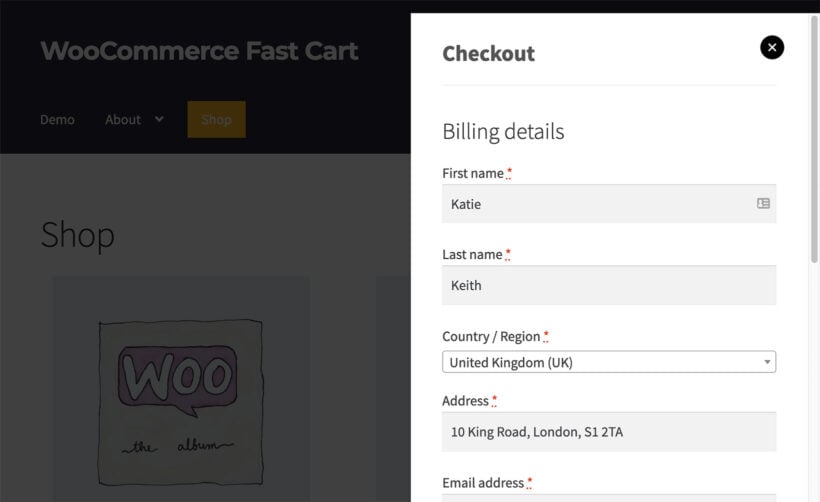
WooCommerce Fast Cart replaces the default cart and checkout pages with a popup that opens over whatever page the customer is on. It doesn't change the checkout form, the payment methods or any of the settings you've already configured. All it does is take your existing, already-optimized checkout and display it inside a popup so the customer never leaves the page they were browsing.
That makes Fast Cart a complement to the changes earlier in this guide, not a replacement for them. If you've already used YITH Checkout Manager to shorten the form, set up guest checkout under WooCommerce → Settings, configured your payment gateways and added Kestrel's Shipping Calculator on the product page, Fast Cart wraps all of that in a popup that the customer never has to leave. The shorter the journey from "I'm interested" to "thanks for your order", the higher the conversion rate.

For a wider playbook on the checkout itself, see my guides to customizing the WooCommerce checkout page, speeding up the checkout, and setting up a multi-step checkout for forms that genuinely need more fields.
Final thoughts
Honestly, this is the part of the store I'd fix first. If a friend asked me where to spend a weekend on their WooCommerce store to make the biggest difference to revenue, I'd point them at the checkout every time.
The reason is that everything else in ecommerce flows through it. You can spend more on ads to bring in more traffic, but those visitors only convert at the rate your checkout supports. You can work on raising your average order value, but a bigger basket only counts if the customer actually finishes the order. Pull your checkout conversion rate from 30% to 45% and the same traffic, the same products and the same email list start producing meaningfully more revenue, without spending an extra penny on acquisition. You can drastically improve the customer journey with plugins like WooCommerce Fast Cart.
For more on the surrounding playbook, take a look at my guides to the ecommerce customer journey, real checkout examples from major retailers, and ten ecommerce best practices that include the checkout work above.