7 ways to create the best checkout experience

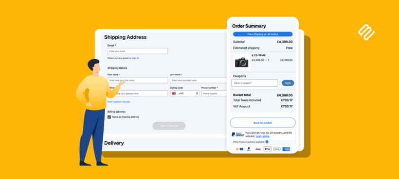
The checkout is where browsing turns into revenue, or where it quietly falls apart. These seven changes give customers the best checkout experience and get more of them to the confirmation page.
Most of the work that goes into an online store, like the product photos, the descriptions and the ad spend, leads to one screen: the checkout. If that screen is long, confusing or slow, a lot of the effort before it goes to waste. Checkout is consistently where stores lose buyers who were otherwise ready to pay.
The good news is that a better checkout experience is mostly made of small, fixable things. None of the seven below needs a developer, and several are free to set up.
There are lots of ways to approach checkout page optimization, and I'll cover the most effective below. My favorite is WooCommerce Fast Cart, which replaces the standard cart and checkout with a fast on-page popup, so customers move through the entire checkout without ever leaving the page they're on.
A better checkout means more completed orders
The default WooCommerce checkout is functional, but it asks a lot of the customer. It's a separate checkout page with two columns of fields, and the shopper has to leave whatever they were doing to fill it in.
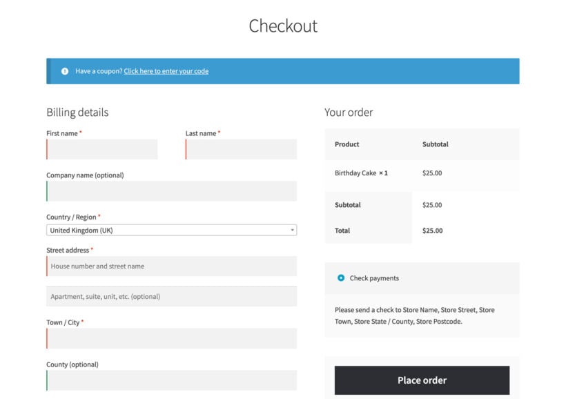
Every field, page load and unexpected step is a moment where someone can change their mind. Reducing those moments is the whole game. The seven tips below each remove a bit of friction, and together they add up to a checkout people finish.
1. Keep the checkout short and simple
The single biggest win is cutting the checkout down to what you genuinely need. WooCommerce ships with more fields than most stores use, and every one you remove is one fewer thing standing between the customer and their order.
Start by trimming the form. My guide to removing checkout fields covers which ones are safe to drop, like the company name or the second address line for stores that don't need them.
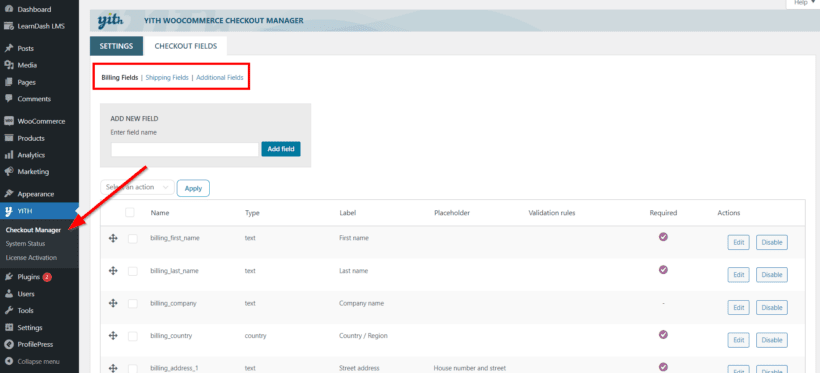
The easiest way to add, remove and reorder fields without code is YITH WooCommerce Checkout Manager. It gives you a drag-and-drop list of every billing and shipping field, so you can disable the ones you don't need and edit the labels and validation on the rest.
Then shorten the distance to the checkout itself. WooCommerce Fast Cart shows the cart and checkout in an on-page popup, so customers never load a separate page. They add a product. The cart slides out. They pay right there.
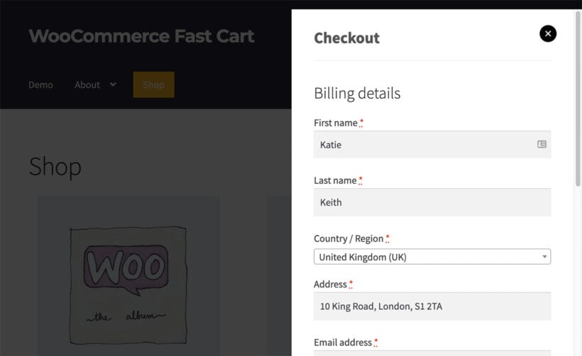
If you sell a single main product, you can go further with a direct checkout that skips the cart entirely, or a popup checkout that keeps everything in one window.
2. Make guest checkout easy
Forcing shoppers to create an account before they can pay is one of the most reliable ways to lose a sale. A first-time buyer rarely wants a login. They want to pay and leave.
Turn on guest checkout under WooCommerce → Settings → Accounts & Privacy so customers can order without registering.

You can still offer account creation as an optional tickbox at the end, never as a gate. My full walkthrough on WooCommerce guest checkout covers the setting and how to make the guest flow faster.
3. Offer the payment options customers expect
People abandon checkouts when their preferred way to pay isn't there. Card payments are the baseline, but digital wallets like Apple Pay and Google Pay, plus buy-now-pay-later options, now matter to a large share of shoppers.
Offer two or three well-chosen methods rather than a long list. My guide to choosing a WooCommerce payment gateway covers the main options and how to pick the right ones for your customers. Whatever you offer, make the payment step feel secure with clear labeling and recognizable logos.
4. Be clear about shipping and delivery
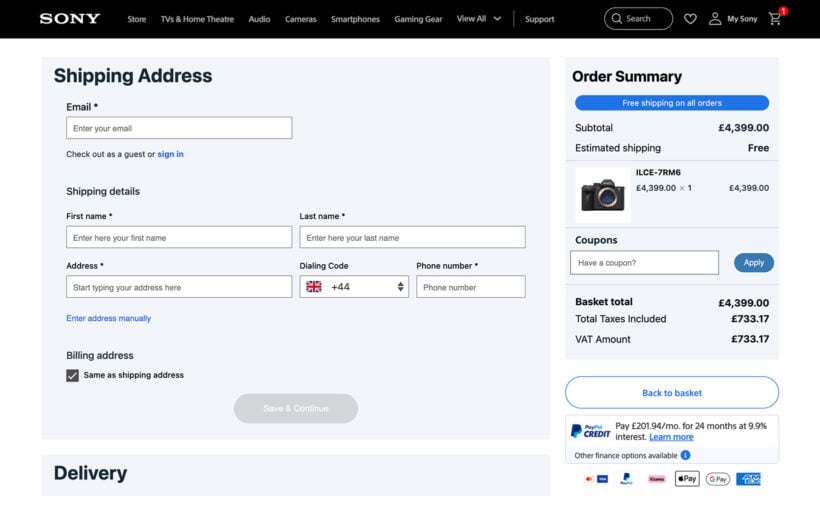
Unexpected shipping costs are the classic reason carts get abandoned. Show the cost as early as you can, ideally before the customer reaches the final step, so there are no surprises at the end.
If you sell food, flowers or anything time-sensitive, let customers pick a slot. A delivery slot picker turns a vague "when will it arrive" into a clear choice the customer controls. The plugin I recommend for this is WooCommerce Opening Hours and Delivery Times from Simba, which lets customers choose a delivery date and time during checkout.
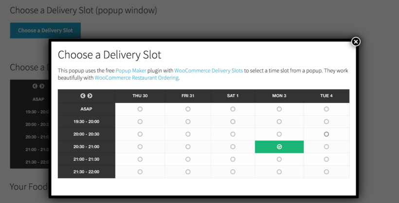
Clear delivery information also cuts down on support questions, which is a quiet win for a small team.
5. Use address autofill to cut typing
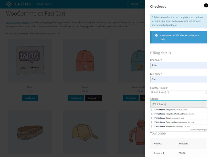
Typing a full address is one of the slowest parts of any checkout, and it's worse on a phone. Address autofill lets customers pick their address from a single line, and the rest of the fields fill in automatically.
It's a small change that removes a real chunk of effort. My guide to Google address autocomplete in WooCommerce walks through the setup, and Fast Cart can add autocomplete to its popup checkout so the speed carries through to the on-page flow.
6. Add usability cues that build confidence
Small interface signals tell customers the checkout is working and that they're doing it right. They're easy to overlook, but their absence makes a checkout feel clunky.
A few that matter:
- Highlight the field a customer has clicked into, so they always know where they are.
- Show a loading state on the 'Place order' button after a click, so nobody presses it twice or assumes the page has frozen.
- Use clear inline error messages next to the field that needs fixing, not a single warning at the top.
- Make sure the whole thing works on a phone, since most shoppers now check out on mobile.
A clean, modern checkout like the one Fast Cart provides handles most of these out of the box, but they're worth checking on any setup. For a broader look at this, my guide to WooCommerce UX goes from product listing through to checkout.
If you want a fully optimized checkout without designing one yourself, CheckoutWC is the plugin I'd reach for. It replaces the WooCommerce checkout with a polished, conversion-focused design, with express checkout buttons, field highlighting and a mobile-first layout built in.
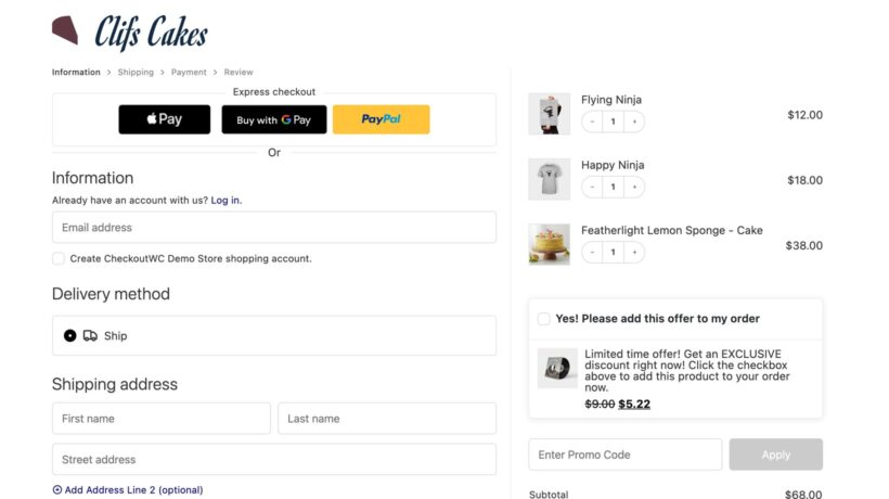
Better still, CheckoutWC is compatible with WooCommerce Fast Cart. You can show the optimized CheckoutWC checkout inside the Fast Cart popup, so customers get a polished checkout that opens right on the page they were already on.
7. Make the order confirmation page work harder
The checkout experience doesn't end when the payment goes through. The order confirmation page is the one moment you have a customer's full attention after they've bought, and most stores waste it on a bare receipt.
Use it to do three things: thank the customer in your own voice, tell them clearly what happens next, and give them a reason to come back, like a discount on their next order. Keep any product suggestions genuinely relevant and low-key, since the sale is already done.
It's the difference between a one-time buyer and the start of a repeat customer.
Frequently asked questions about the checkout experience
What makes a good checkout experience?
A good checkout experience is short, clear and predictable. The best checkouts keep the form to the essentials, allow guest checkout, show shipping costs early, offer the payment methods customers expect, and work smoothly on mobile.
How do I reduce cart abandonment at checkout?
Remove friction. Cut unnecessary fields, enable guest checkout, be upfront about shipping costs, and shorten the path from cart to payment with an on-page or popup checkout so customers complete the order without leaving the page.
Does the checkout page affect conversions?
Yes. The checkout is the last step before payment, so every extra field, page load or unexpected cost is a chance for the customer to drop out. Simplifying it is one of the highest-return changes you can make to a store.
How do I improve the WooCommerce checkout without code?
Use the built-in WooCommerce settings to enable guest checkout and trim fields, then add a plugin like WooCommerce Fast Cart for an on-page popup checkout. None of it requires writing code.
How do I optimize my checkout page?
Checkout page optimization means removing anything that slows a buyer down. Trim the form to the essentials, allow guest checkout, show shipping costs early, and offer the payment methods customers expect. Shortening the ecommerce checkout flow with an on-page or popup checkout has the biggest effect, since it cuts the number of pages between the cart and payment.
Putting it all together
You don't have to do all seven at once. Start with the two that win back the most orders: cut the checkout down to the essentials, and turn on guest checkout. Those alone recover a good share of the customers you're currently losing.
The best checkout experience is the one that gets out of the customer's way. When you're ready to speed up your whole ecommerce checkout flow, WooCommerce Fast Cart handles the heavy lifting by moving the cart and checkout into a fast on-page popup. Walk your own checkout as a first-time buyer, count the steps, and cut the ones that don't earn their place.